Two babies, one card, and one small folded space to get everything right. A twins birth announcement has to carry two names, two sets of details, and still feel personal, whether it's going to grandparents, coworkers, or a friend who wants the photo first and the stats second. The right layout depends on who's receiving it and how much information they want to read.
For a 125 × 175 mm folded card, the best designs are the ones that stay readable in preview and make the twins feel clearly matched without turning the card into a wall of text. Mail This lets you review the exact wording, design, recipient, and total before anything is sent, so you can test the plan before you pay.
Table of Contents
- 1. Classic Formal Twin Announcement
- 2. Playful Double the Fun Announcement
- 3. Meet the Twins Name Introduction Announcement
- 4. Minimalist Photo-Forward Announcement
- 5. Big Sibling Perspective Announcement
- 6. Faith-Inspired Double Blessing Announcement
- 7. Vintage Keepsake Stats Card
- 7 Twin Birth Announcement Styles Compared
- Pick the Layout That Fits Your Family
1. Classic Formal Twin Announcement
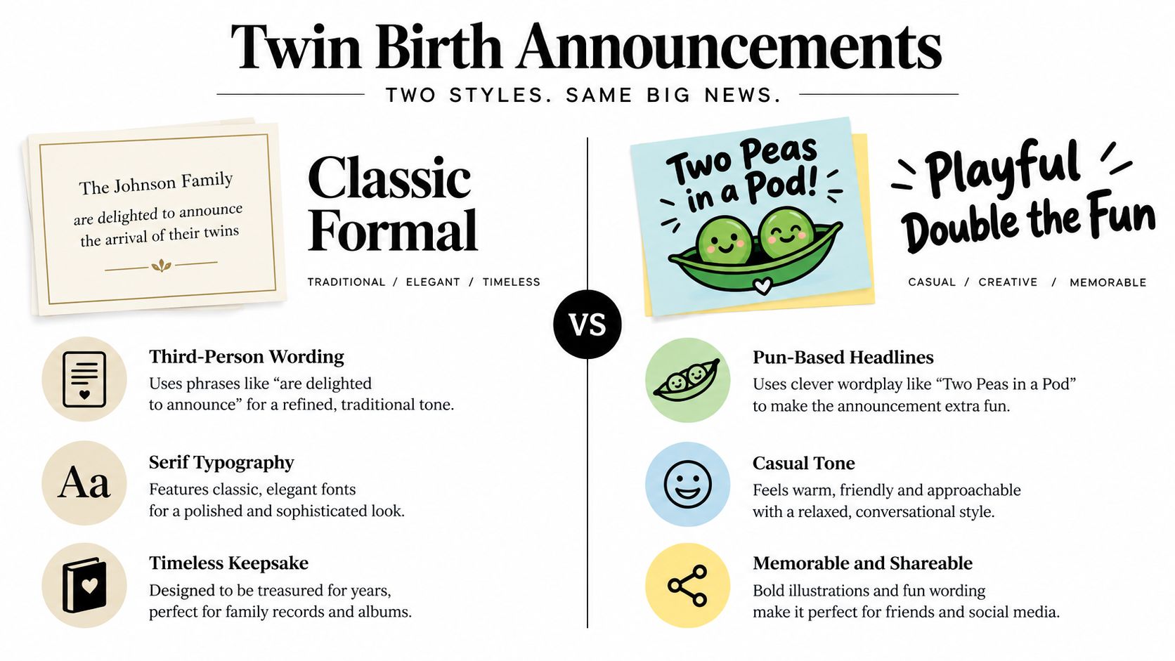
A formal twin card works when the family wants a keepsake that feels settled, polite, and easy to frame. The cleanest version uses third-person wording, puts the parents' names at the bottom, and names both babies in the order they were born. That structure also helps the card read smoothly for older relatives who expect a traditional announcement.
Practical rule: keep the main body to roughly 40 to 60 words, then add a smaller line for weights and lengths only if the card still breathes. On a 125 × 175 mm folded format, that usually means one strong opening sentence, one sentence with both babies' names and birth date, and one compact detail line.
A good formal card might read like a printed keepsake rather than a social post. For example, “Mr. and Mrs. Daniel Morales are delighted to announce the arrival of twins, Lucia Rose and Mateo James, born March 4, 2025.” Another version can lean slightly warmer while staying formal, such as announcing that the family is pleased to welcome twin sons or daughters on a specific date.
A formal announcement is also the easiest style to approve in the Mail This preview because nothing depends on decorative text placement. The message should stay separate from the artwork, which matters when the babies' names and dates have to be exact. If you want a model for wording that still feels gracious and concise, the right phrasing often sits close to the tone used for other new-baby cards, like the examples in new parent congratulations wording.
What to keep tight
- Use full names in birth order: It avoids confusion if one twin arrived first and the family wants that detail included.
- Keep birth details simple: Date is usually enough unless the family specifically wants times, weights, and lengths.
- Protect the layout: Too many lines can crowd the folded card and make the type shrink faster than you want.
2. Playful Double the Fun Announcement
A playful twin announcement works best when the card is going to friends, siblings, cousins, and coworkers who'll enjoy the joke before they scan the details. That is exactly the moment twin-themed wording earns its place, because the headline can do the emotional work while the body stays short and clean. A line like “Double the Fun” or “Twice as Nice” gives the card a clear personality without forcing the whole design to be clever.
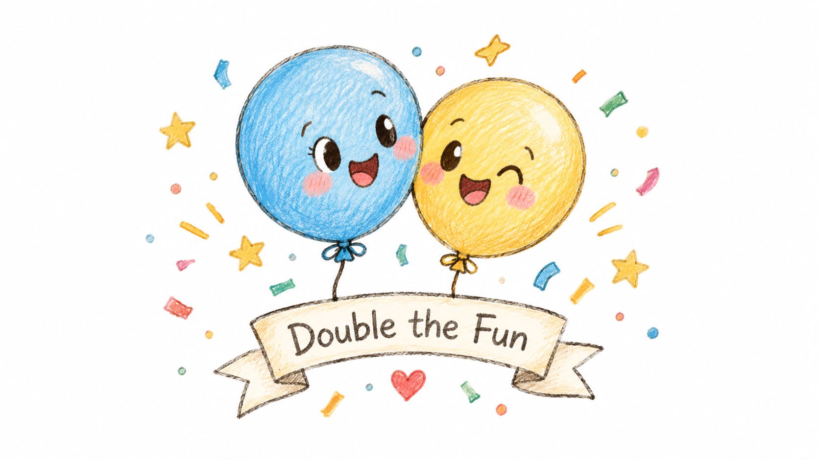
A playful style needs discipline. Put the pun in the headline, then let the body carry the facts, because the headline is what people notice first in the preview and on the finished card. If the joke is too dependent on a nickname or an inside reference, it can confuse recipients who don't know the family well.
Best use case: keep the wording broad enough that grandparents, friends, and office teammates all understand it at a glance. “Two peas in a pod” and “Party of two became party of four” work because they're easy to read quickly and don't rely on a private family story.
The photo choice matters more here than in a formal layout. One bold illustration or one strong newborn photo usually beats a busy collage, because the headline already adds energy. If you're stuck on the wording, ask for several headline options, then choose the one that sounds like your family instead of the one that tries hardest to be witty.
A simple approval trick
Use a short headline, then a plain name-and-date line underneath. That makes the Mail This preview easier to judge before payment, because you can see immediately whether the joke still leaves enough room for the actual announcement.
3. Meet the Twins Name Introduction Announcement
This is the layout I like when the twins need their own space on the card. Instead of presenting them as one combined event, it introduces each baby separately, which works well when the family wants to highlight different birth times, weights, or lengths. It also feels fair to both babies, especially when the stats are meaningful to the parents.
The cleanest version uses two balanced blocks, one for each child, with the same structure in both. That means the eye can move easily from one twin to the other without wondering whether one got more prominence than the other. If the measurements are on the card, keep the units consistent and make sure the wording doesn't blend them into one sentence.
Separate labeling helps a recipient know which details belong to which baby. That's the whole reason this format reads so well on a folded card.
A strong version might say “Meet Charlotte Grace” and then list her weight, length, and birth time on separate lines, followed by a matching block for Henry James. Another approach introduces the pair together first, then gives each baby a small profile. In either case, the card feels more personal because each twin gets a distinct visual identity.
For wording that stays warm without getting cluttered, the best move is to keep the parents' names in the footer. That keeps the babies at the center of the card instead of crowding the top with adult names. If you want help shaping the tone so it still sounds natural, what to say in a baby card gives a useful baseline for short, readable phrasing.
Layout detail that saves approvals
Use identical spacing for both babies. If one block is longer or more decorative than the other, the card can look lopsided in preview even when the wording itself is fine.
4. Minimalist Photo-Forward Announcement
A minimalist card is the right answer when the photo already says most of what the family wants to say. Two newborns in matching caps, or a soft black-and-white image with both babies together, can carry a card with almost no extra text. This style is especially useful when you want a modern look that still feels calm.
Text should stay short enough to read at folded-card size. Phrases like “Two of a kind” or “Double the love” work because they don't compete with the image. If the photo is doing the heavy lifting, the written part should behave like a caption, not a paragraph.
The photo choice needs a little care. Use a high-resolution image, good lighting, and a crop that keeps both babies visible without cutting off faces or tiny hands. A neutral background also helps the card feel polished, especially if the twins are wearing coordinated clothing or simple hats.
The preview step matters here more than almost anywhere else. A photo can look perfect on a phone screen and then land awkwardly once the folded card orientation changes. Mail This makes it easier to check whether portrait or horizontal is the better fit, and a custom greeting card preview is exactly the kind of place where that crop needs a careful look before you approve it.
Approval note: if the picture feels slightly busy in preview, simplify the text instead of adding more decoration. Minimalist cards work because they leave room for the photo to breathe.
5. Big Sibling Perspective Announcement
A sibling-led announcement works when the family wants the card to feel warm and relational rather than purely informational. It lets the older child or children become part of the message, which can be charming when a big sister or brother is proud to introduce the twins. This style also helps the card feel less like a birth notice and more like a family snapshot.
The strongest versions keep the sibling names clear and the sentence simple. “Our family just doubled” can open the card, followed by a line that identifies the older sibling and welcomes the twins by name. If there are multiple children already at home, list them in birth order so the family line reads naturally.
This format is one of the few where a short handwritten note can add real value after printing. A parent can sign beneath the printed message, or add a personal line from the older child if that fits the family's voice. A photo that includes the siblings with the twins usually makes the whole idea land better than a studio image of only the newborns.
The main trade-off is space. Once you add sibling names, a family phrase, and twins' names, the card can get full quickly, so the wording has to stay compact. That's why this style works best when the photo supports the message and the text doesn't try to do everything at once.
Keep the sibling angle readable, not crowded. The card should still feel like a birth announcement, not a family newsletter.
6. Faith-Inspired Double Blessing Announcement
A faith-centered twin announcement is a natural fit when the family wants the card to reflect gratitude as much as joy. This style often pairs a short scripture line with a simple statement of thanks, which gives the announcement a reverent tone without making it heavy. For many families, that balance feels more honest than trying to sound festive for the sake of it.
Psalm 127:3 is a common choice for this format, and the key is to keep the quotation exact if it's used. The verse should stay short enough that the babies' names remain the visual focus, because the card is still an announcement, not a devotional piece. If the family prefers a gratitude statement instead of a direct quote, that can be even cleaner.
A good card might say that children are a heritage from the LORD, then name the twins and give the birth date. Another can just express gratitude for a double blessing and add the babies' names underneath. The less space the scripture takes, the easier it is to keep the layout balanced on a folded card.
Tone matters here. Some families want a formal church-friendly wording, while others want something softer and more personal. A thank-you line to relatives or church members can work well, but only if it stays brief and doesn't squeeze the names into a tiny line.
Practical rule: quote scripture only if you can keep it accurate and legible. If there's any doubt, a short gratitude line is safer and often looks better in the preview.
7. Vintage Keepsake Stats Card
A vintage-style card is the right choice when the family wants the announcement to feel collectible. The design usually leans on a bordered frame, a retro font, and a neat stats block that can be saved, displayed, or framed later. It has a different energy from the minimalist approach, because the details themselves become part of the design.
This layout works well when the twins' names, dates, times, weights, and lengths are all important to the family. The key is not to cram them together. Use a simpler font for the stats than for the names, and keep the block to a few lines so the card doesn't feel overworked. A serif or script name treatment pairs well with a cleaner detail section.
The look is strongest when the paper tone supports it. Cream or muted stock helps the card feel like a keepsake instead of a flyer, especially if the family plans to frame it. The primary trade-off is readability, because decorative type can get fussy quickly if the stats are dense or the spacing is tight.
This is the style I'd choose for parents who care about the birth record as much as the announcement itself. It can feel very personal when done well, but it does ask for careful proofing, because every number and spelling becomes part of the visual design. If one detail is wrong, the whole card feels off.
A vintage card succeeds when it looks deliberate. If the font gets too ornate, the twins' names disappear into the style instead of standing out.
7 Twin Birth Announcement Styles Compared
| Style | 🔄 Implementation complexity | ⚡ Resource requirements & speed | 📊 Expected outcomes | ⭐ Key advantages | 💡 Tips |
|---|---|---|---|---|---|
| Classic Formal Twin Announcement | Moderate, typeset wording, proof approval | Low–moderate, simple typography and printed stock; moderate turnaround | Timeless keepsake; formally received by older relatives | Familiar, clear, adaptable across twin types | Use full names/order, keep text ~40–60 words, confirm final wording |
| Playful "Double the Fun" Announcement | Low, short headline + illustration | Moderate, custom illustration or template; quick to produce | Memorable and shareable; light, casual tone | Eye-catching, fun, easy to vary with AI prompts | Keep pun as headline, request multiple headline options, pair with one bold illustration |
| "Meet the Twins" Name Introduction Announcement | Moderate, split-layout blocks require balanced formatting | Low, text-focused but needs careful layout; moderate proofing | Clear individual recognition; helps recipients learn both names | Distinct identity for each twin; easy to proof | Use identical block formats, double-check weights/times, keep consistent units |
| Minimalist Photo-Forward Announcement | Low, simple layout but photo prep critical | High, requires high-resolution photo and cropping; fast to finalize once photo chosen | High visual impact; stylish and modern | Photo-forward clarity; clean, contemporary look | Choose sharp, well-lit photo, keep text <10 words, preview crop before print |
| Big Sibling Perspective Announcement | Low, simple family-focused copy or photo | Low–moderate, may need group photo and name confirmations | Warm, personal; highlights family dynamics | Inclusive and heartfelt; great for close contacts | List siblings in birth order, confirm spellings, leave space for a handwritten note |
| Faith-Inspired "Double Blessing" Announcement | Low, copy includes scripture and measured tone | Low, needs correct verse and tasteful religious motifs | Meaningful to faith communities; expresses gratitude | Deeply resonant for religious recipients; simple and reverent | Specify Bible translation, keep scripture short, verify quotations |
| Vintage Keepsake Stats Card | Moderate–High, ornate typography and stats layout | Moderate, decorative fonts, cream paper, possible sepia photo; slower proofing | Heirloom feel; often saved or framed by recipients | Keepsake quality with clear stats presentation | Use legible serif/script combos, limit stats lines, confirm all numbers and spellings |
Pick the Layout That Fits Your Family
The best twins birth announcement is the one that matches the people receiving it and the kind of story you want the card to tell. Formal wording fits conventional relatives and framed keepsakes. Playful wording works better for friends and casual family. A stat-led card suits parents who want the birth details preserved, and a photo-forward design is the cleanest option when the image should do most of the talking.
The 125 × 175 mm folded format rewards restraint. Two names, one clear message, and just enough supporting detail usually beat a crowded card that tries to include everything. In practice, the easiest approvals come from layouts that keep the twins visually balanced, separate the facts cleanly, and avoid overdesigned text inside the image.
A good workflow is simple. Draft two wording options in the style you like, compare them in the Mail This preview, and check every name, time, and weight against the hospital record before you pay. If you're using a photo, confirm the crop and orientation in the preview too, because a card that looks fine in a draft can feel cramped once it's typeset.
For families sending printed announcements, that preview step is where confidence comes from. It turns the choice from guesswork into a real decision based on how the card looks, which is exactly what you want before the order is placed.
Mail This can help you turn a twins birth announcement into a printed folded card with exact wording, a preview you can review before payment, and mailing handled in the United States. If you want to test a formal, playful, photo-forward, or stats-based layout, visit Mail This and draft the version that feels right for your family.