You're standing in the card aisle with a birthday dinner on the clock, a sympathy note in the back of your mind, or a thank-you you meant to send three days ago. The wall looks full, but everything starts to blur into the same mix of script fonts, pastel covers, and polite little phrases that all seem close enough and somehow still wrong.
That feeling usually isn't about too many types of greeting cards. It's about not having a clear way to match the card's format to the message you need to send. A good card isn't just a category on a shelf, it's a pairing of tone, structure, paper, and intent. If those pieces line up, the card feels natural. If they don't, even a pretty design can land badly.
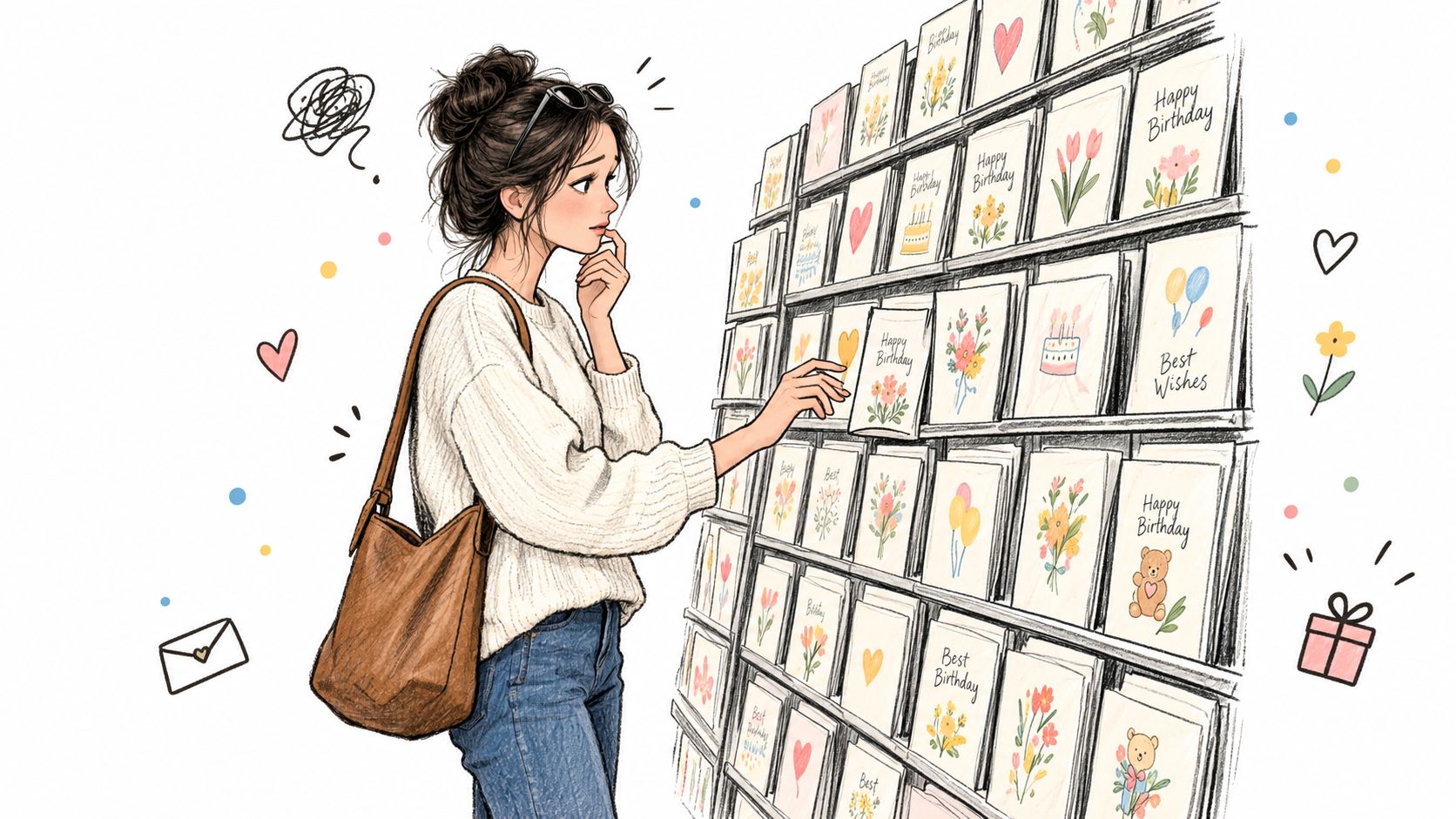
Table of Contents
- The Moment You Need a Card and Nothing on the Rack Feels Right
- The Three Core Physical Formats Every Sender Should Know
- Occasion-Based Card Types and the Emotions They Carry
- Comparing Humorous, Sentimental, and Keepsake Card Styles
- Emerging Card Types Shaped by Personalization and Sustainability
- A Simple Framework for Choosing the Right Type of Greeting Card
- When Store-Bought, DIY, and Fulfillment Services Each Make Sense
- Choosing With Confidence the Next Time You Reach for a Card
The Moment You Need a Card and Nothing on the Rack Feels Right
A lot of shoppers think they're choosing between “birthday,” “sympathy,” or “thank-you.” In practice, they're choosing between signals. A card with bold color, playful type, and a glossy finish says one thing. A card with soft spacing, restrained language, and a heavier stock says something very different.
That's why the rack can feel confusing even when it's organized neatly. The category label tells you the occasion, but the physical details tell you the mood. Font weight, color palette, paper thickness, and envelope style all nudge the message before the envelope is even opened.
The first read matters more than people admit
If a sympathy card looks cheerful, the message gets muddy before anyone reads a line. If a birthday card looks too formal, it can feel stiff and cold. The cover is doing a job, even if nobody says it out loud.
Practical rule: Choose the card that matches the feeling you want the recipient to have in the first five seconds.
That's why a more useful way to think about the rack is as a set of format-and-intent pairings. The occasion matters, but the emotional job matters first. Once you start looking for that match, the same shelf that felt random starts to look surprisingly logical.
The Three Core Physical Formats Every Sender Should Know
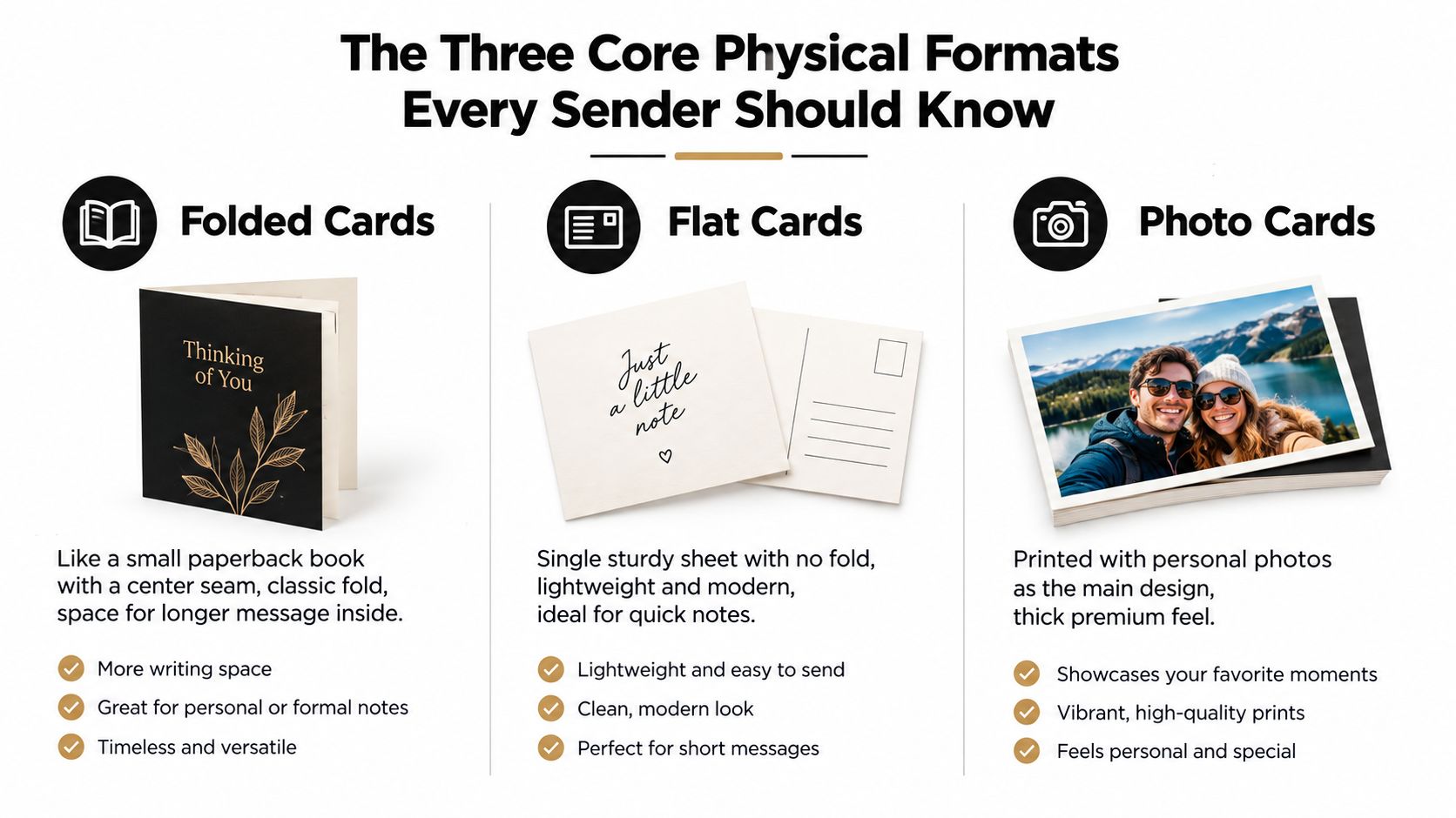
Some shoppers want a card that gives them room to write a real note. Others want something simple they can sign fast and mail without fuss. A third group wants the photo, not the folded paper, to do most of the talking.
Folded cards
A folded card works like a small paperback book with a center seam. You get a front cover, an inside message area, and often enough space to write something warmer than a quick signature. That's why this format is the most flexible choice for longer personal notes, formal occasions, and anything that needs a little breathing room.
The format is also the most familiar to shoppers because it feels complete. It opens, reveals, and holds the message inside instead of exposing everything at once. In retail and commercial use, this is the shape many people picture first when they think of a classic greeting card.
Flat cards
A flat card is one sturdy panel, closer to a postcard than a booklet. It's best when the message is short, the signature is simple, and the sender wants the card to feel direct. Because there's no fold, it also tends to feel cleaner and more modern on a desk, shelf, or mantel.
Flat cards are especially useful when the wording is doing only part of the work. A sharp image, a strong headline, or a single sincere line can carry the whole piece. If folded cards are for opening a note, flat cards are for stating it plainly.
Photo cards
Photo cards make the image the lead character. The photograph carries the emotional weight, while the text stays minimal and supportive. That's why they work so well for family updates, seasonal greetings, and announcements where the recipient wants to see people first and read second.
Paper finish shifts the mood across all three formats. Matte usually reads softer and more relaxed, while linen feels a little more formal and tactile. A heavier cover stock can also make the whole piece feel more substantial in the hand, which is part of why many commercial card designs rely on that sturdier feel.
Simple shortcut: If the message needs room, choose folded. If the message needs speed, choose flat. If the image is the message, choose photo.
Occasion-Based Card Types and the Emotions They Carry
Occasion labels help people sort the rack, but emotion is what determines whether the card feels right. A sympathy note, a congratulations card, and a thank-you card can all use a similar folded format, yet each one needs a different voice, pacing, and amount of white space.
Sympathy, congratulations, and thanks work differently
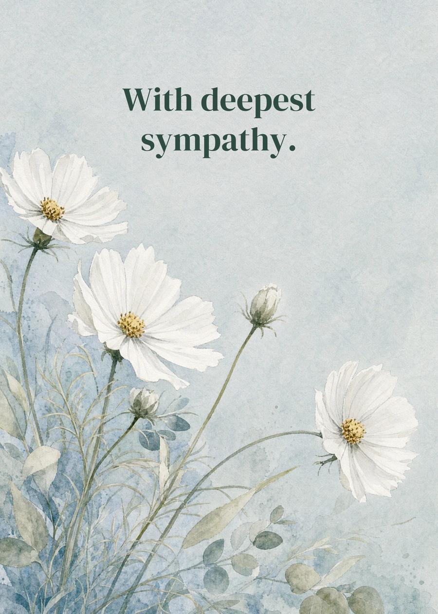
A sympathy card should feel quiet. Soft palettes, restrained wording, and a minimal layout help the sender offer presence without pressure. The goal isn't to decorate grief, it's to acknowledge it with care.
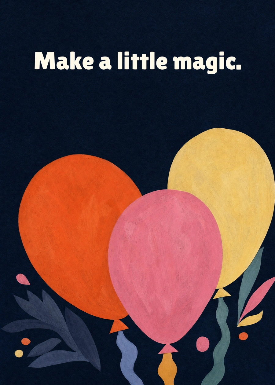
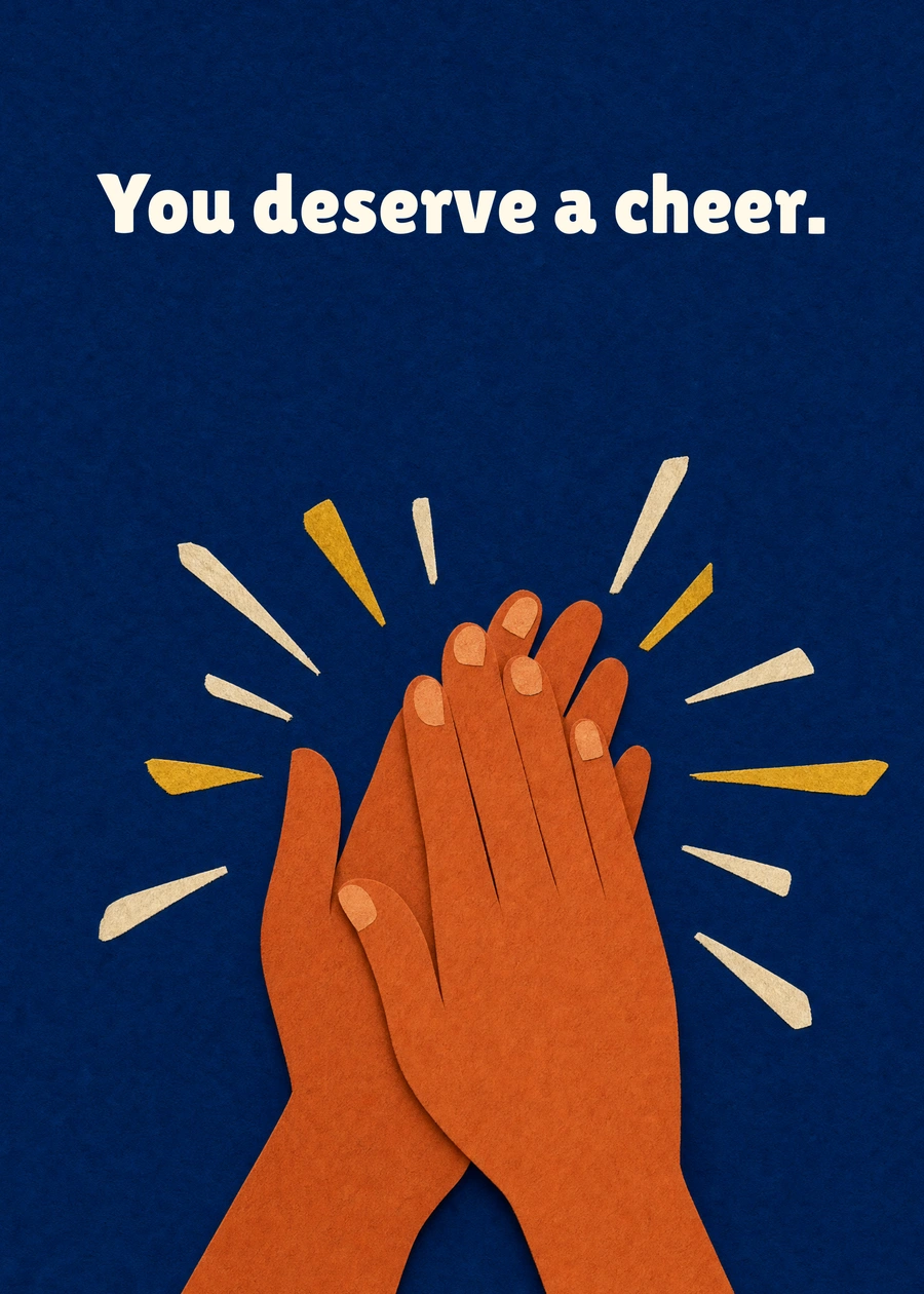
A congratulations card moves in the opposite direction. Bright color, stronger contrast, and a more energetic opening line make room for celebration. The message can name the achievement directly, which is why this category often feels more personal when it points to the exact moment being marked.
Thank-you cards sit in the middle. They're usually compact, sincere, and specific. The best ones sound like they were written by a person who noticed something and wanted to say so clearly.
| Card Type | Dominant Emotion | Typical Palette | Message Length | Opening Tone |
|---|---|---|---|---|
| Sympathy | Careful, consoling | Soft, muted | Short to moderate | Gentle and quiet |
| Congratulations | Joyful, celebratory | Bright, confident | Moderate | Warm and energetic |
| Thank-you | Grateful, sincere | Simple, balanced | Short | Direct and appreciative |
A useful way to shop is to ask what emotion should be strongest when the card opens. If it's comfort, keep the design low-key. If it's celebration, let the card feel more alive. If it's gratitude, keep the language clean and honest.
For birthday-specific browsing, a birthday card guide can help narrow the field, but the same emotional logic still applies.
Comparing Humorous, Sentimental, and Keepsake Card Styles
Style crosses every occasion. Two birthday cards can both say “happy birthday” and still feel worlds apart because one is a joke, one is tender, and one is built to be kept.
Humorous cards
Humorous cards lean on puns, punchy illustration, and typography that practically shouts the joke before it's read. They're a strong fit for close friends, people who like banter, milestone birthdays, and get-well-soon notes where a little levity is welcome. If the recipient laughs easily and often saves the funniest card from the pile, this style usually lands well.
Sentimental cards
Sentimental cards use softer colors, handwritten-feel type, and longer interior copy. They suit weddings, anniversaries, farewells, and moments where sincerity matters more than wit. These cards usually invite rereading, which is part of their appeal.
Keepsake cards
Keepsake cards are the ones people don't want to throw away. Heavier paper, foil accents, pop-up mechanics, and other tactile details make the card feel more like an object than a quick note. They're a good fit when the relationship, occasion, or memory feels worth preserving.
| Card Style | Tone & Design | Best For | Likely Recipient Action |
|---|---|---|---|
| Humorous | Bold, playful, joke-driven | Close friends, casual birthdays, light recovery notes | Laugh, then maybe recycle |
| Sentimental | Soft, warm, reflective | Weddings, anniversaries, farewells | Reread and keep for a while |
| Keepsake | Heavier, detailed, often embellished | Milestones, treasured relationships | Display or save |
If the recipient tends to keep cards on a dresser or mantel, a keepsake style is worth considering. If they prefer a quick laugh and move on, humor may be the better bet. If the moment feels emotionally loaded, sentiment usually beats cleverness.
Emerging Card Types Shaped by Personalization and Sustainability
The old card rack used to divide neatly into birthdays, holidays, and thank-yous. That's still true on the surface, but a second layer is now shaping what people choose, and it's about personalization and materials.
Personalization is getting more specific
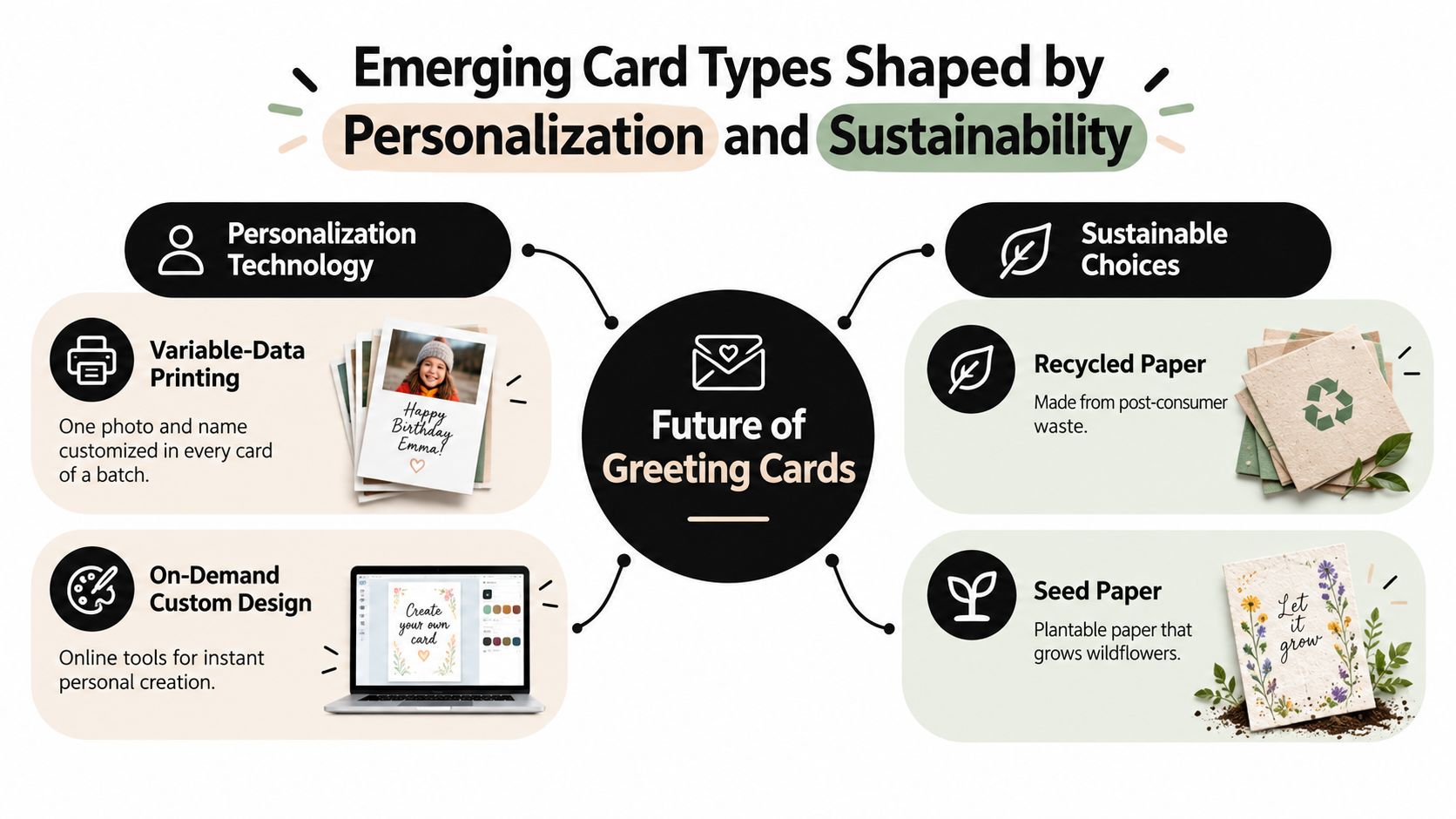
Variable-data printing lets the same design batch carry different names, images, or details from card to card. That blurs the line between a traditional greeting card and a small custom print piece. It also makes the card feel less like inventory and more like a one-to-one message.
Hybrid digital-physical cards are part of the same shift. A printed card can hold the main sentiment while a QR code reveals a video message or extra note. For people who want both a physical keepsake and a digital voice, that combination solves a real problem without replacing the card itself.
Sustainable materials are becoming part of the decision
Recycled stock, plantable seed paper, and other lower-waste materials appeal to senders who want the gesture to feel aligned with their values. The material becomes part of the message. A card made to be planted, reused, or recycled can feel more deliberate than a glossy throwaway piece.
You can see this shift in the way shoppers now think beyond the occasion and ask what the card will do after it's opened. That question changes the purchase. It also makes custom and eco-conscious formats feel less niche and more like separate branches of the same family.
A custom card option fits naturally into that shift because it treats the message as part of the design, not an afterthought.
A Simple Framework for Choosing the Right Type of Greeting Card
The fastest way to choose a card is to start with the person, not the shelf. Relationship closeness shapes how formal, playful, or restrained the card should feel before you even pick a color or format.
Ask these four questions in order
- Who is the recipient? A close friend can usually handle more humor or personality than a new colleague or a distant relative.
- What is the emotional intent? Are you comforting, celebrating, thanking, or just staying in touch?
- Which physical format carries that intent best? Folded for longer notes, flat for short messages, photo for image-led updates.
- Which stylistic family fits the person? Humor, sentiment, keepsake detail, or something cleaner and more minimal.
That sequence narrows the field fast. You're no longer asking, “Which card looks nice?” You're asking, “Which card will make this person feel what I want them to feel?”
| Step | Question | What It Decides |
|---|---|---|
| 1 | Who is the recipient? | Tone and closeness |
| 2 | What is the emotional intent? | Occasion and mood |
| 3 | Which format fits? | Folded, flat, or photo |
| 4 | Which style fits the person? | Humor, sentiment, keepsake, or simple |
A colleague's promotion usually calls for a congratulations card that feels polished and clear. A grandparent's birthday often works better with a folded or photo format that gives the message more warmth and room. A friend who's having a hard week may need a sympathy-style card that stays quiet and direct.
For help shaping the wording once you've chosen the card, a thank-you card writing guide is useful when gratitude is the main job.
When Store-Bought, DIY, and Fulfillment Services Each Make Sense
People often treat card buying like a binary choice. You either grab one off the rack, or you make one yourself. There's a third path that matters more than most shoppers realize, especially when the goal is to send something thoughtful without spending the whole evening on it.
Store-bought cards win on speed and certainty
Store-bought cards are strongest when you need a proven message fast. A standard birthday note, a last-minute sympathy card, or a quick congratulations message usually benefits from a reliable design that's already doing most of the emotional work. The tradeoff is that you're working within the store's selection, paper choices, and message options.
DIY cards win on personal labor
DIY cards carry a kind of emotional weight you can't fake. Hand lettering, custom illustration, and handwritten details make sense for first birthdays, weddings, family anniversaries, and other moments where the making is part of the gift. The cost is usually time and attention, not just supplies.
Fulfillment services solve a different problem
Fulfillment services sit between those two options. They're for senders who want the card to feel personal but don't want to handle printing, addressing, and mailing themselves. That makes them useful for busy professionals, long-distance relatives, and small teams that need a consistent look without building a manual process.
Useful lens: Don't rank the options by status. Rank them by time, budget, and emotional effort.
| Option | Time Required | Cost Range | Best For |
|---|---|---|---|
| Store-Bought | Low | Usually lower | Fast decisions, standard occasions |
| DIY | High | Variable | Deeply personal, handmade moments |
| Fulfillment Services | Low to moderate | Variable | Personalized sending without the logistics |
Choosing With Confidence the Next Time You Reach for a Card
The easiest decision rule is simple. First, name the emotional intent. Second, match it to the physical format. Third, choose how you want the card sourced based on your time and energy.
Folded cards usually carry formal, emotional, or longer messages best. Flat cards work when you want the note to feel quick and direct. Photo cards strengthen the visual story, while keepsake and humorous styles work best when the relationship already has shared history.
That's the part many want when they say they need help with types of greeting cards. They don't really need a longer list of categories. They need a fast way to move from “I have to send something” to “I know exactly what fits.”
The aisle feels less overwhelming once the question changes from “What's available?” to “What's the job of this card?” As personalization tools, AI-assisted drafting, and hybrid fulfillment keep removing friction, the next card you send doesn't have to feel rushed. It can feel chosen.
If you want a faster way to turn a thoughtful idea into a physical card, Mail This makes that handoff simple with personalized cards and mailed delivery in the United States. It's a practical fit when you know the message you want, but you'd rather skip the trip to the store and the mailing hassle.