Your calendar reminder pops up, the birthday is close, and you've got the same half-formed idea a lot of senders start with. A text feels too thin, a store run feels rushed, and you want the card to sound like you know the person. A birthday card solves that problem when it's personal, printed cleanly, and mailed on time.
Table of Contents
- Why a Physical Birthday Card Still Matters
- Personalizing a Birthday Card for the Recipient
- What Goes Into a Quality Folded Card
- Approving the Card Before You Pay
- Getting the Card Printed and Mailed
- Three Examples of the Same Workflow in Action
- Keeping the Message Exactly as You Wrote It
Why a Physical Birthday Card Still Matters
A birthday card works because it arrives as an object, not a ping. The recipient opens an envelope, sees handwriting or designed text, and has a moment that feels more deliberate than a quick message thread. Printing made that kind of gesture easier to produce in the 1850s, and companies such as Hall Brothers and later Hallmark turned it into a commercial product in the United States (WNYC's history of greeting cards).
Why the physical format still wins
Industry reporting puts birthday cards at the top of the U.S. greeting-card market, ahead of sympathy, thank-you, wedding, thinking-of-you, get-well, new-baby, and congratulatory cards (greeting-card market data). Another industry source describes birthdays as the largest single occasion in the market and notes that a typical recipient receives around 8 birthday cards a year, while about two-thirds of birthday cards are mailed.
That points to a simple truth. A birthday card is a relationship problem as much as a design problem. The message, the artwork, the fold, and the delivery all need to point in the same direction.
Practical rule: if the card feels right in a preview but would feel awkward in the recipient's hands, it is not finished yet.
If you are choosing between a clever message and a thoughtful one, start with the recipient's experience. The rest of this guide follows the card from rough idea to a real mailbox, so the final result feels intentional instead of generic.
Personalizing a Birthday Card for the Recipient
The easiest way to make a card feel specific is to answer a few questions before you touch the artwork. Who is it for, how close are you, what tone fits, and what should the card avoid? Industry research on birthday-card design treats cards as structured social signals, which is why the details matter so much (design and relationship patterns).
The fields to decide first
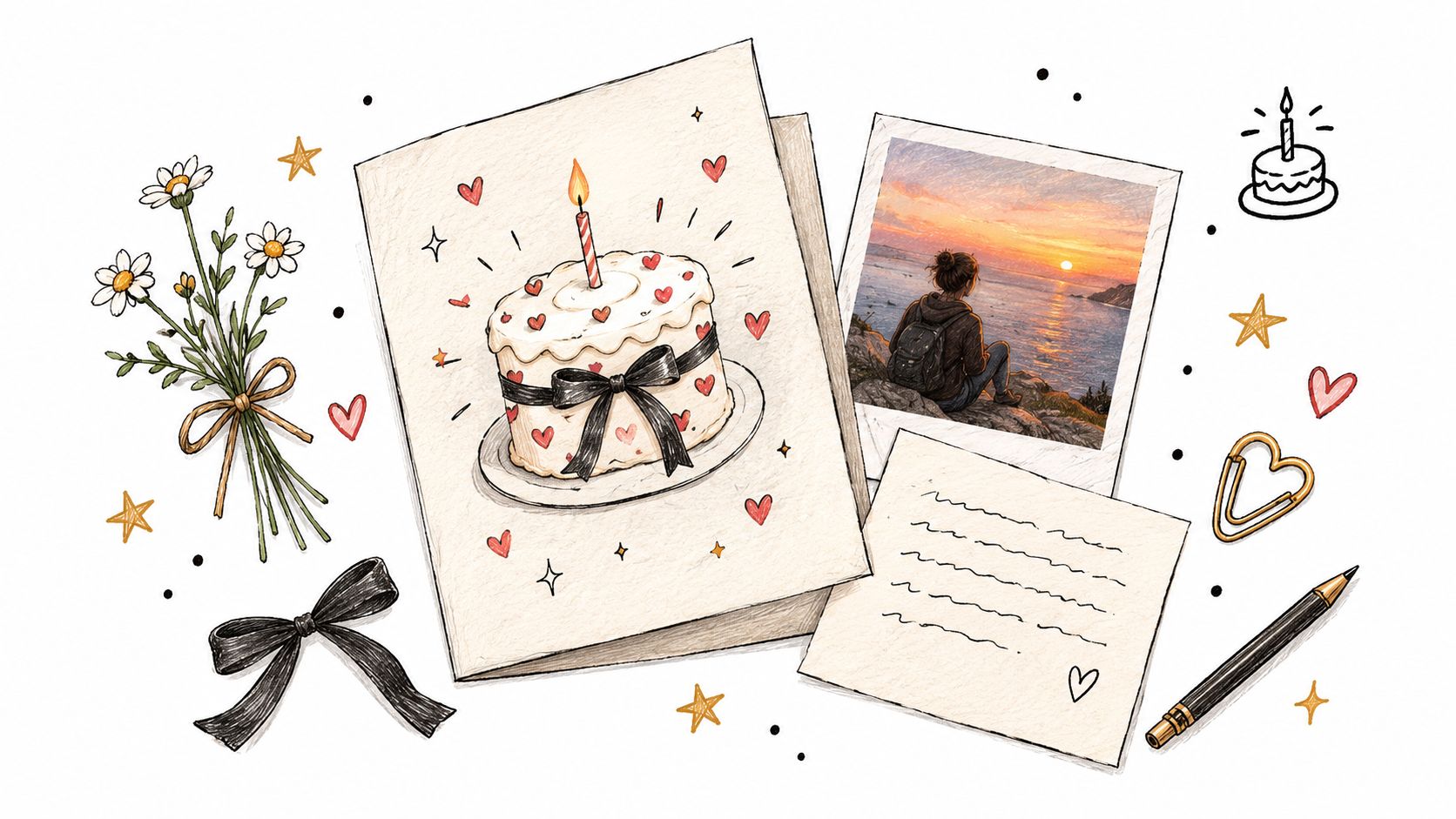
Before you generate anything, write down these inputs:
- Recipient relationship: friend, parent, partner, coworker, sibling, grandparent.
- Tone: playful, calm, affectionate, formal, sentimental.
- Shared memory: a trip, a habit, an inside joke, a family ritual.
- Humor tolerance: none, light, moderate, high.
- Emotional intensity: soft appreciation, warm affection, personal.
- Age and life stage: this affects whether the card should feel youthful, dignified, celebratory, or understated.
A longtime friend can handle a joke that a parent would find strange. A new partner usually needs warmth without overfamiliarity. A parent who dislikes fuss often prefers a simple message with a sincere line, not a loud graphic or a jokey punchline.
If you're using an assistant-led creative tool, feed it those details in plain language. Say, “This is for my older sister, we share a dry sense of humor, keep it warm but not mushy,” or, “This is for my dad, he likes simple cards and doesn't want anything flashy.” That kind of input gives the wording and visuals a much better starting point than a blank prompt.
For a focused example of recipient-specific wording, see the guide to birthday card wishes for a coworker.
Match the message to the relationship
A card for a close friend can lean into a shared memory. A card for a parent should usually sound respectful and personal, with less pressure to be funny. A card for a partner can be more intimate, but it still needs restraint if you're keeping the design elegant.
The point is not to squeeze every feeling into the card. The point is to choose one clear emotional lane and stay in it. That keeps the card from feeling generic, or worse, confused.
What Goes Into a Quality Folded Card
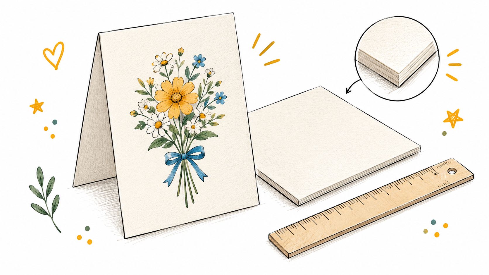
A folded birthday card starts with the paper. A premium card usually uses 300 to 350 GSM cover stock, which is roughly 110 to 130 lb cover weight. Paper weight guidance from print workflows says 300 GSM feels firm and familiar, while 350+ GSM feels stiffer and more substantial (paper weight guidance).
Why the specs matter to the person opening it
Thin stock can feel flimsy the moment it is picked up. Heavier stock gives the card more presence, which helps the message feel intentional instead of disposable. That matters with birthdays because these cards are often kept, displayed, or tucked away with other meaningful mail.
The file setup should match the folded format before approval. For a 125 × 175 mm folded format, the artwork needs the finished trim size, the flat-open dimensions, the fold position, the bleed, safe text margins, the color profile, and the image resolution set out clearly. In plain terms, the file has to account for both the final card and the extra space needed for cutting and folding.
The technical terms to watch
A 3 mm bleed gives the printer room to trim the sheet without leaving a thin white edge if the cut shifts slightly. A print setup checklist can help you spot that requirement before the file is approved.
CMYK matters because printing uses subtractive color, not the light-based color system used on screens. If the file is prepared the wrong way, colors can look different on paper than they do on a phone or laptop.
For readers comparing card styles before they settle on a fold, the overview of types of greeting cards is a useful starting point.
The safest approval question is simple, “Would I still like this if I couldn't see the digital mockup?”
Approving the Card Before You Pay
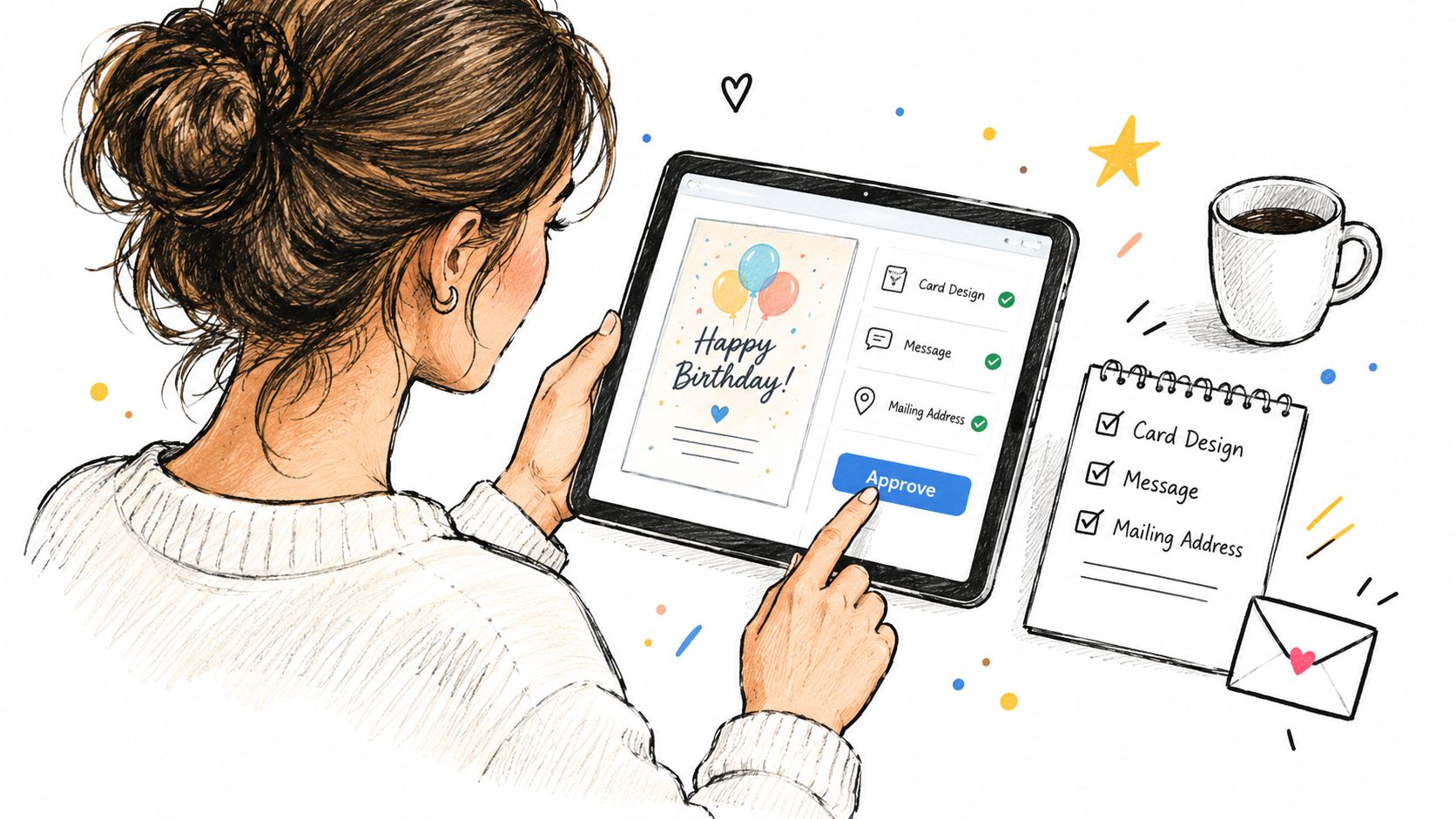
Preview is the moment that prevents expensive, embarrassing mistakes. The approval screen should show the artwork, the exact wording, the recipient details, and the total before anything is charged. If any of those pieces feel off, stop there and fix them.
What to check line by line
- Recipient name: make sure spelling, punctuation, and honorifics are correct.
- Message text: read it aloud once, because a line that looks fine on screen can sound wrong when spoken.
- Artwork and layout: confirm the visual tone matches the person you're sending to.
- Delivery address: verify every field before payment.
- Total cost: confirm the amount shown upfront, including tax if it's displayed there.
This step matters even more when the message is baked into the image itself. If the wording changes after generation, the whole image may need to be regenerated, which adds friction and can alter the look. Independent typesetting avoids that problem because the text stays editable and exact.
For a workflow that uses approval-first sending and upfront totals, one option is Mail This, which handles preview, printing, and domestic mailing as a single process.
Practical rule: don't approve a card just because it looks nice. Approve it because the text, address, and design all match the person you had in mind.
A complete preview protects you from two common errors at once, the emotional mistake of the wrong tone and the practical mistake of the wrong destination. Both are easier to catch before payment than after production starts.
Getting the Card Printed and Mailed
Once you approve the card, the process moves from screen to print. You do not need to print, fold, stuff, address, or stamp anything yourself. The fulfillment partner handles the physical work, then prepares the card for domestic delivery.
What the sender usually gets
With a service that packages production and mailing together, the base price includes the envelope and domestic postage, with tax shown upfront. For this example service, the fixed price is $9.99 per card, and production plus mailing are handled by Cardly. That keeps the buyer from juggling separate print and postage steps.
Approval starts the physical process. Production comes next. Then the card is addressed and handed off for mailing. The sender sees an estimated arrival window, not a guaranteed delivery date, so birthdays that matter should leave a little cushion.
Boundaries to keep in mind
Domestic coverage is not the same as universal coverage. The mailing workflow is designed for U.S. destinations, so confirm that the recipient's address is supported before you finalize the order. If you are sending to a less common address type, check coverage first instead of assuming it will work.
For a plain walkthrough of the mail step itself, see how to send a card in the mail.
The benefit of this model is simplicity. You make the creative decisions, approve the final version, and let the mailing system do the physical work. That helps when you want a real card to arrive without turning the task into a project.
Three Examples of the Same Workflow in Action
A good birthday card workflow doesn't force every recipient into the same style. It uses the same steps, then changes the inputs to fit the person. That's what makes the result feel custom without becoming complicated.
A close friend with an inside joke
For a friend, the sender might choose a playful tone, a private memory, and a little visual humor. The approved copy could reference the shared joke without explaining it, because the card is meant for one person, not an audience. The artwork can be bright, casual, and slightly irreverent, as long as it still reads cleanly in print.
A parent who dislikes attention
For a parent, the inputs shift. The tone becomes quieter, the message focuses on appreciation, and the design stays restrained. A simple layout with a warm line and a calm color palette often works better than something loud or crowded.
A partner turning 60
For a milestone birthday, the sender can lean into warmth and dignity at the same time. The message might honor the relationship, mark the occasion, and avoid jokes that make the age feel like the punchline. The artwork can be polished and celebratory, but it should still leave room for the words to breathe.
Each of these cards started with the same workflow, then changed because the recipient changed. That's the main lesson. The best result usually comes from making the message, visuals, and delivery choices answer the same question, “What would feel right to this person?”
Keeping the Message Exactly as You Wrote It
A lot of card tools blur the line between image generation and text generation, and that's where problems start. If the message is embedded inside a raster image, even a small wording change can force a fresh render. It can also make the text harder to read or slightly off in spacing, contrast, or alignment.
Why separated text is safer
Independent typesetting keeps the wording editable after the artwork is set. That matters because the sender can correct a name, tighten a line, or soften a phrase without changing the whole design. It also keeps the final card closer to the sender's exact voice, which is the point of a birthday message in the first place.
A card should deliver one clear feeling to one specific person. If the typography is fuzzy or the wording shifts during generation, that feeling gets diluted. Exact text control is not a minor technical detail, it's part of the card's meaning.
When a service separates the message from the artwork, the sender can check spelling, contrast, and line breaks independently. That's a better standard for anyone who wants the final card to read the way they wrote it.
If you want a simpler way to turn a birthday idea into a printed card, Mail This handles the preview, approval, printing, and domestic mailing in one workflow. It's built for the moment when you already know what you want to say, and you just need help getting it onto a real card and into a U.S. mailbox.