Personalized Christmas cards no photo can feel more thoughtful than a generic family picture, because the personalization comes from custom wording, unique artwork, and a message that sounds like you. If you want the process handled end to end, Mail This offers an approval-first workflow that designs, prints, and mails domestic cards for $9.99 per card with the envelope and postage included.
The hard part is usually not the card itself. It's staring at a blank prompt, wondering whether a photo is required, and then realizing the people you're sending to would probably care more about the note than the snapshot anyway. That shift matters, because a well-chosen phrase, a shared joke, or a piece of seasonal artwork can carry more emotional weight than a polished image that doesn't say much about the relationship.
Table of Contents
- Why No-Photo Cards Feel More Personal
- The Tradition of Custom Holiday Cards
- Designing for Legibility and Impact
- How Mail This Simplifies Card Creation
- Choosing the Right Artwork Style
- Planning for Holiday Delivery Deadlines
- Final Tips for Success
Why No-Photo Cards Feel More Personal
The most awkward holiday card moment is often the one where the photo feels forced. You have a decent picture, but it says more about outfits and lighting than about the person receiving it. A personalized Christmas card without a photo sidesteps that problem and lets the message do the emotional work.
Specificity beats decoration
A card feels personal when it references something the recipient recognizes, not when it just shows a face. That can be a shared memory, a private joke, a note about an interest, or artwork that reflects the relationship. A cousin who loves cabins, a neighbor who gardens, or a former coworker who still mentions a favorite trip will usually respond more warmly to something that feels chosen for them than to a generic holiday portrait.
Practical rule: If the recipient could receive the same card from five other people, it isn't personal enough yet.
This is why no-photo cards often reduce creative friction. You're no longer trying to assemble a perfect family scene, coordinate outfits, and edit a picture before you can even start writing. Instead, you can put the energy into the part that matters most, the message.

Story-first cards feel more intimate
A photo captures a moment. A story says something about the bond. That's why a few well-chosen lines can feel more intimate than a polished image, especially when the recipient knows the backstory behind them. If you're sending to someone who values privacy, the no-photo route also avoids putting children, homes, or family situations on display.
The strongest cards usually combine name, memory, appreciation, and a visual cue. That mix is simple, but it's effective because it gives the recipient a clear reason to feel singled out. In practice, that means the card reads less like holiday inventory and more like a deliberate act of attention.
The Tradition of Custom Holiday Cards
No-photo personalization isn't a workaround, it's the original model. The commercial Christmas card emerged in Victorian Britain in 1843, when Sir Henry Cole commissioned John Callcott Horsley to create a printable design with room for a personal greeting. Britannica also credits Boston lithographer Louis Prang with the first major American commercial Christmas cards, and by the 1880s his company was producing more than 5 million cards annually. The history of the Christmas card shows that the category was built around a standard printed image plus individualized sentiment.
The format has always been hybrid
That early model matters because it separates art from message. The sender didn't need to draw an illustration from scratch, and they didn't need a photograph to make the card meaningful. They chose a printed design, then added a line that belonged to the relationship.
Commercial greeting-card production had already started expanding by about 1860, and Prang added seasonal greetings to his product range in 1875. The pattern is clear. Personalization grew out of mass production, not against it. That makes today's personalized Christmas cards no photo especially familiar in historical terms, even if the tools are newer.
Physical cards still depend on the message
The broader greeting-card market also shows that people still value paper correspondence. Britannica reports that U.S. households purchased approximately 7 billion greeting cards annually during the 2010s, with retail sales exceeding $7.5 billion. Historical estimates vary, but they point in the same direction, a large population still sends and receives seasonal mail. Market context for greeting cards reinforces a simple truth, the core value is the act of sending a message, not the presence of a photo.
That's why no-photo cards don't feel lesser. They're closer to the origin of the format than people assume, and they fit the same basic contract, a printed object carrying a message chosen for one person.
Designing for Legibility and Impact
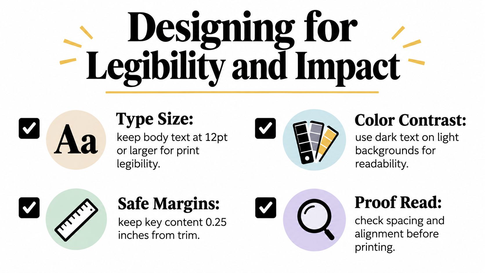
Without a photo, the card design has to carry more of the mood. That doesn't mean cramming in more ornaments, more typefaces, or more effects. It means making every visible element easier to read and more deliberate. Typography, contrast, and spacing become the design system.
Let the message do the heavy lifting
A no-photo card works best when the front has one clear job, setting the tone. The inside or main message can then do the more personal work. If the front is overloaded with textures, scripts, and tiny flourishes, the recipient has to fight the design before they get to the sentiment.
USPS guidance recommends that delivery addresses stay centered on the envelope in 10 to 14 point type, with clear spacing, left justification, and strong contrast. It also warns that brilliant backgrounds or reverse printing can interfere with automation discounts. USPS addressing guidance is a good reminder that decorative design and functional mailing shouldn't compete with one another.
Keep artwork away from the address block and barcode area, and treat the envelope like a utility surface, not a second canvas.
Proofing matters more than people think
Color also shifts when it hits paper. The International Color Consortium notes that color management depends on profiles for devices such as monitors and printing systems, and print-production guidance consistently points out that uncoated stock absorbs ink, increases dot gain, and reduces gamut compared with coated stock. Color management basics matter because a card that looks crisp on screen can soften or darken after printing.
That's especially important for personalized cards, where variable names and short messages can expose small mistakes. A clean workflow uses one fixed text color, enough contrast, and a preview that reflects the actual folded layout, not just the artwork alone. The exact approved message should be typeset separately from the illustration so decorative effects don't warp letters or hide typos.
A simple test helps: if the card still reads clearly at arm's length and the envelope remains easy for USPS to process, the design is doing its job.
How Mail This Simplifies Card Creation
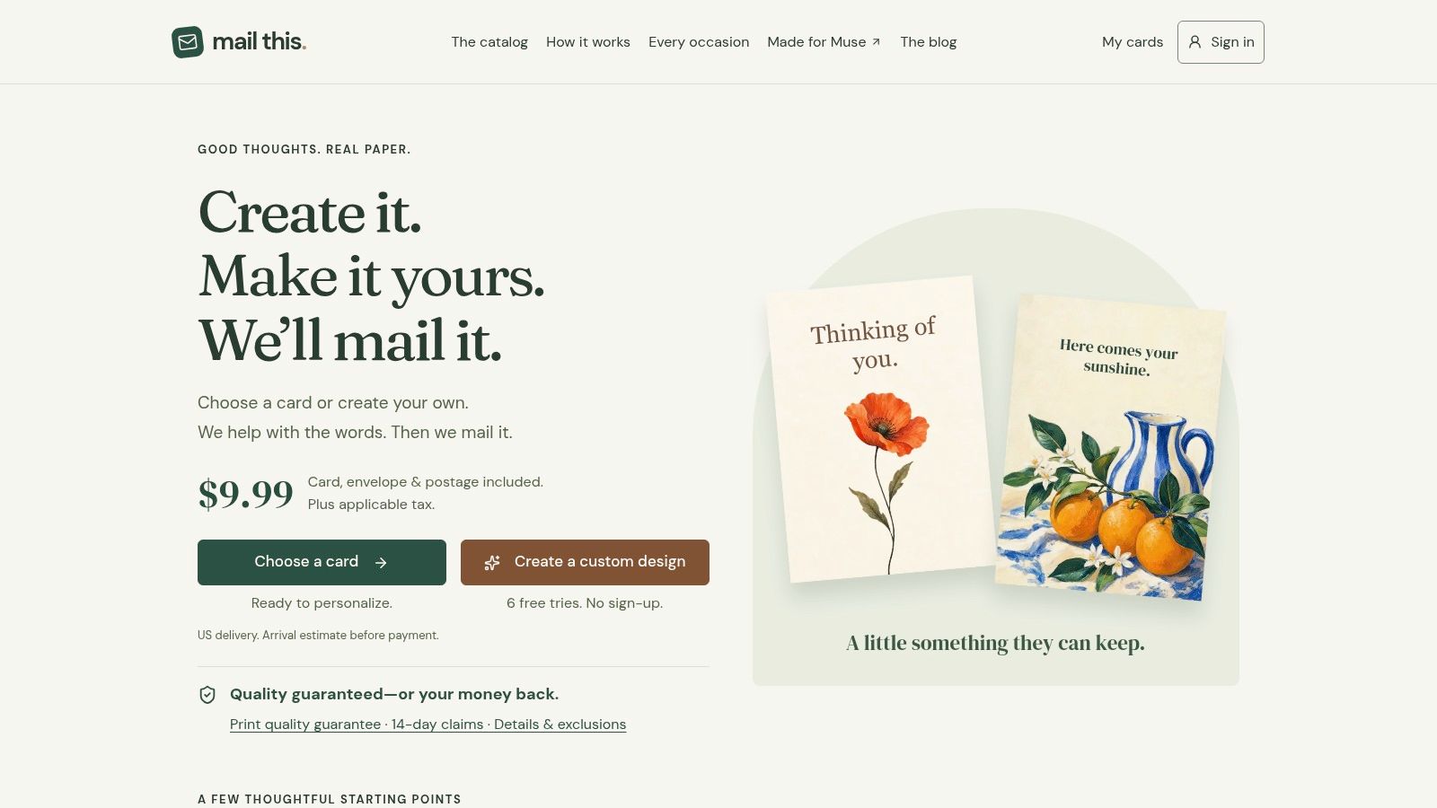
A good holiday card idea shouldn't require design software, a printer, and a separate post office run. Mail This turns a short prompt into a previewed card, then handles printing, addressing, and domestic mailing through Cardly after you approve the result. For a no-photo card, that means the creative part stays conversational and the physical part stays operational.
The workflow is built around approval
The key feature is the preview step. You see the design, the recipient details, and the total before payment moves forward, which removes the awkward gap between “I like this idea” and “I hope it prints correctly.” That matters when you're sending something personal, because the last thing you want is a surprise address issue or a layout that looks different after production.
Mail This uses fixed pricing of $9.99 per card, including the envelope and domestic postage, plus applicable tax shown upfront. It also includes one free custom artwork generation after sign-in, with additional packs of five for $1.49 after card prepayment. Those numbers matter less as a sales pitch than as a planning tool, since they make the approval step and total cost visible before you commit.
Production stays separate from the writing
One of the cleaner operational choices is independent typesetting. The exact approved message is set apart from the artwork, which protects legibility when the design includes stylized backgrounds or AI-generated visuals. That's useful for no-photo cards, where the wording often carries the emotional weight and shouldn't be sacrificed to decoration.
Cardly handles printing, packing, addressing, and handoff to the postal service. If you want a direct path from a message draft to a mailed card, that structure removes several failure points at once. You can read more about the mechanics in the custom greeting card overview, but the important part is simple, approval comes first, production comes second.
Choosing the Right Artwork Style
Not every relationship needs the same visual language. A card for a sibling can be playful, a card for a grandparent can be warmer and more traditional, and a professional holiday note usually needs restraint. The right artwork style depends on how much personality the recipient expects from you.
| Style | Best For | Key Considerations |
|---|---|---|
| Minimal typography | Distant relatives, colleagues, formal greetings | Keep the message short, use high contrast, avoid clutter |
| Illustrated scene | Close family, close friends, memory-based cards | Match the scene to a shared place, hobby, or joke |
| Symbolic seasonal pattern | Broad mailing lists, mixed audiences | Safe when you want flexibility without feeling generic |
| Narrative artwork | Recipients who know your shared story | Works best when the image gives the message context |
Match tone to relationship
A cabin scene can feel cozy and specific for one recipient, but vague for another. The same is true of ornaments, pets, maps, or hand-drawn flourishes. The goal isn't to pick the fanciest art. It's to pick the visual cue that fits the person who'll open the envelope.
For a structured seasonal option, a design like this Christmas cabin card shows how a single setting can carry the mood without relying on a photo. That kind of artwork works when the relationship is warm and the message doesn't need explanation.
Use context to narrow the choice
Generic festive clipart usually fails because it could belong to anyone. A more specific illustration, even a simple one, does better because it implies attention. If the recipient loves winter walks, a muted forest scene fits better than a busy collage. If they're the kind of person who keeps cards on a mantel, clean lines and stronger contrast will often hold up better over the season.
The best no-photo cards don't try to impress with volume. They pick a tone and stay inside it.
Planning for Holiday Delivery Deadlines
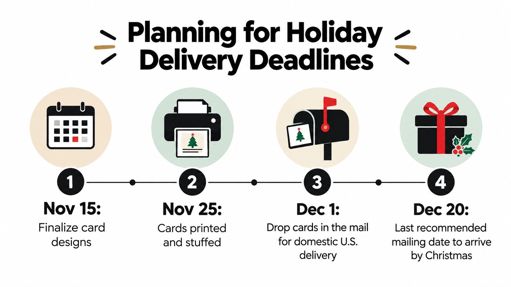
A strong card still misses the mark if it arrives too late. Holiday mailing leaves little room for last-minute changes, and the practical deadline is usually earlier than people expect. For U.S. mail, USPS holiday guidance recommends December 17 for Ground Advantage and First-Class Mail to the lower 48 states, December 18 for Priority Mail, and December 20 for Priority Mail Express. USPS holiday mailing dates Alaska, Hawaii, Puerto Rico, and U.S. territories need even more lead time.
Build backward from the mailbox
The easiest trap is waiting for the design to feel finished. Holiday cards reward early approval more than endless revision, especially when the message is already set and the recipient list is known. Locking the preview early gives production time to move without the pressure of a looming cutoff.
A practical workflow keeps the moving parts in order. Finalize the message, confirm the address, and approve the layout before the mailing window gets crowded. If something looks off, an early review gives you room to fix it without missing the season. For a straightforward walkthrough, how to send a card in the mail is a useful reference point.
A card that ships on time with a simple message is better than a polished concept that never reaches the mailbox.
Treat destination as part of the design brief
Location changes the risk. USPS delivery standards for Ground Advantage note that transit can vary based on origin, destination, acceptance time, and other conditions, so holiday timing is never just about the card itself. USPS delivery standards for Ground Advantage makes that clear, and the difference matters for non-contiguous destinations, military addresses, and anyone mailing close to the cutoff.
A concrete way to plan is to set your internal approval date before the carrier deadline. If you want to use a December 17 Ground Advantage target, approve the artwork, message, and address list a few days earlier so there is still time to correct a typo or recheck a unit number. A no-photo card may be easy to create, but it still needs the same logistical discipline as any other mailed piece.
Final Tips for Success
No-photo cards work when the sentiment is specific, the design is readable, and the mailing plan is realistic. The mistake people make is treating the photo as the source of personalization, when the actual signal is attention. A name, a memory, a clear visual choice, and a message that sounds like it was written for one person can be more meaningful than a crowded image.
The approval-first workflow matters because it protects that meaning. You see the exact card before it goes out, which keeps the final result aligned with what you meant to say. That's especially useful when the design is minimal, since any spacing issue or awkward wording stands out immediately.
Delivery timing is the final filter. A thoughtful card that misses the holiday loses some of its impact, while a simpler design that arrives on time still feels deliberate. The best senders plan backward, choose artwork that matches the relationship, and let the physical card do what digital greetings usually can't.
If you want to send personalized Christmas cards no photo without juggling design tools or post office logistics, Mail This handles the preview, printing, addressing, and domestic mailing in one approval-first flow. Visit Mail This to turn a short message into a card that feels specific, readable, and ready to mail.