You're standing at the kitchen table with a card in one hand and the envelope in the other, trying not to make it look like you just grabbed whatever blank one was closest. The envelope matters more than people admit. If the outside looks sloppy, the card already feels less thoughtful before anyone opens it.
The clean way to handle how to address a greeting card is to treat the envelope like it has two jobs at once. The outside has to satisfy the post office, and the name line has to satisfy the person receiving it. Get both right, and the card feels polished instead of improvised.
Table of Contents
- Getting the Envelope Right Before You Pick Up a Pen
- The Delivery Block Format the Postal Service Expects
- Choosing Titles and Salutations for Every Relationship
- Addressing Couples, Families, and Modern Households
- Handwritten, Printed, or AI Assisted on the Envelope
- Previewing the Final Card Before It Goes to Mail
Getting the Envelope Right Before You Pick Up a Pen
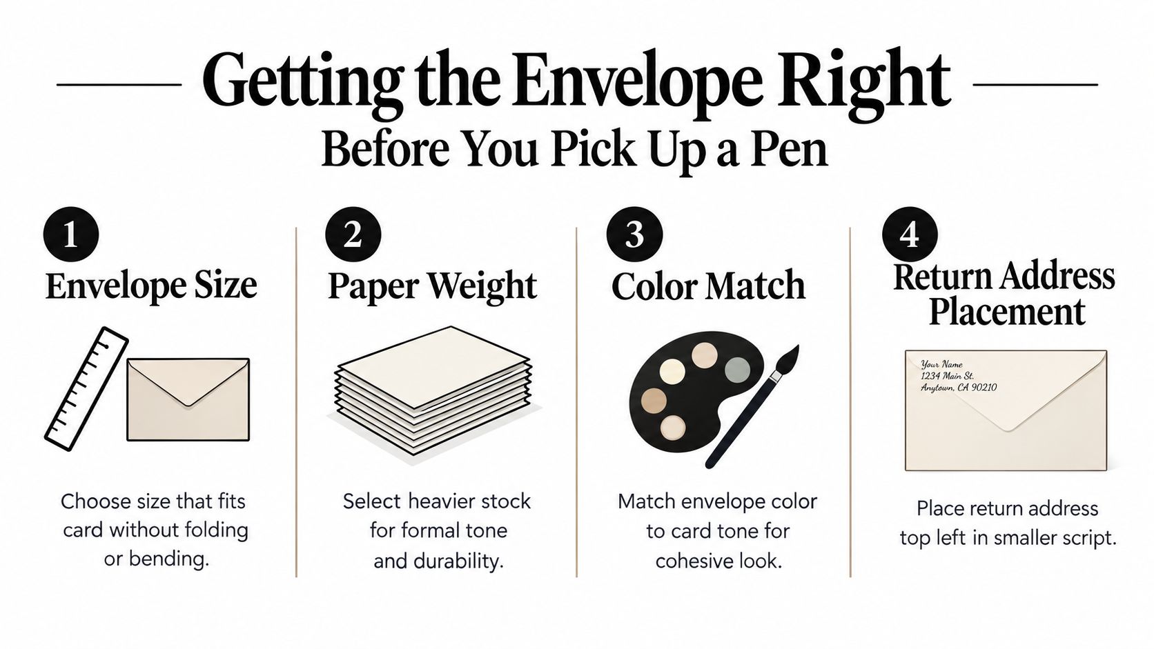
Start with the envelope, not the handwriting. If the card is thick, glossy, or oddly sized, the wrong envelope makes the whole thing look cheap before you've written a word. I'd rather use a plain envelope that fits cleanly than a fussy one that bends the card or clashes with the design.
The return address belongs in the top left corner, in smaller writing than the delivery block. The stamp sits in the top right, which keeps the front balanced and leaves the center open for the recipient. That layout is simple, but it's also the difference between a card that looks intentional and one that feels crowded.
A few mistakes show up all the time. Square envelopes can be charming, but they can also create extra friction in mailing. Pre-printed liners can look great on one card and completely wrong on another, especially if the outer envelope is glossy and the liner is playful.
If you want a simple way to keep the outside and inside consistent, the preview workflow at Mail This custom cards is built for exactly that kind of decision.
Practical rule: pick the envelope that makes the writing easy to read first. Style comes after legibility.
The Delivery Block Format the Postal Service Expects
A greeting card can look lovely and still fail on the envelope if the delivery block is sloppy. USPS wants the outside to be plain, complete, and easy to read: recipient name, street or box information, city, state, and ZIP code, with the address left-justified and machine-friendly USPS addressing standards. That is the outside job, and it should look boring in the best way.
Use a clean, standard stack. Name on the first line, apartment or suite on the second line if needed, street address on the next line, then city, state, and ZIP on the last line. Keep the block free of commas and periods, and keep the delivery and return addresses on the same side, printed parallel to the long edge in dark, clear ink. If you like a simple reference while you format cards, USPS address placement guidance shows the placement rules USPS expects.
For larger mailpieces, USPS also says the delivery block should sit at least 1 inch below and 1 inch to the right of the return address, with the preferred placement in the upper-right quadrant for portrait flats USPS address placement guidance. On a greeting card, the same principle still holds. Give the address breathing room so nothing crowds the scan area or competes with the design.
Here is the format I would use every time:
| Line | What goes there | What to avoid |
|---|---|---|
| 1 | Recipient name | Random nicknames unless that is how they are known |
| 2 | Apartment, suite, or unit, if needed | Cramming it into the street line |
| 3 | Street number and street name | Punctuation in the block |
| 4 | City, state, ZIP | Splitting city and ZIP across lines |
A clean block does more than look tidy. USPS address-quality guidance says the address must be complete and correct, and mailing workflows should verify and correct every address and ZIP used in mailings USPS address-quality guidance. If you are mailing a stack of cards, a preview-and-approval flow from Mail This helps catch bad formatting before anything leaves your desk.
Choosing Titles and Salutations for Every Relationship
The title on the envelope and the salutation inside the card are related, but they don't have to mirror each other perfectly. That's useful, because formal address can sound stiff on the outside while the inside can still feel warm and human. Use the envelope to show respect, then use the salutation to match the relationship.
For formal names, Mr., Ms., Mrs., and Dr. still do the job when you want traditional courtesy. Professional honorifics matter too, especially in client mail, clergy correspondence, or judicial settings. If the relationship is close, first names often work better inside the card even when the envelope stays formal.
| Relationship | Envelope Title | Salutation Line |
|---|---|---|
| Client or new professional contact | Mr. James Carter | Dear Mr. Carter |
| Doctor | Dr. Elena Ruiz | Dear Dr. Ruiz |
| Close friend | Jamie | Hi Jamie |
| Relative you see often | Aunt Maria | Dear Maria |
For a wedding invitation, I'd stay formal on the envelope. For a birthday card to your sibling, I'd drop the stiffness and use the name people commonly call them. The goal is not to prove you know every etiquette rule, it's to signal that you know the person.
Keep the envelope respectful and the inside natural. If one feels too formal for the relationship, the card starts fighting itself.
Addressing Couples, Families, and Modern Households
People freeze, because the old scripts are too narrow for real life. The safest move is to write the name block based on how the household presents itself, then make the salutation match that same logic. A married couple, an unmarried couple, a blended family, or a household with kids from previous relationships all need slightly different handling.
| Household Type | Envelope Line | Salutation |
|---|---|---|
| Married couple, same last name | Mr. and Mrs. Daniel Lewis | Dear Daniel and Ava |
| Unmarried couple | Ava Brooks and Daniel Lewis | Dear Ava and Daniel |
| Same-gender couple | Ava Brooks and Taylor Kim | Dear Ava and Taylor |
| Married couple, different last names | Ava Brooks and Daniel Lewis | Dear Ava and Daniel |
| Blended household with children | The Lewis Family | Dear Lewis Family |
| Single parent with children | Ms. Ava Brooks and Family | Dear Ava and Family |
Traditional etiquette still favors honorifics on formal envelopes, and historical guidance often placed the man's name first for married couples in older British-style correspondence historical etiquette background. That convention still shows up in formal settings, but it's not the only workable option now. When in doubt, use the names people use in daily life, because that's more respectful than forcing a dated pattern.
For tricky mixed-recipient situations, separate lines are cleaner than trying to force everyone into one formula. Newer etiquette advice also supports listing unmarried couples on separate lines in alphabetical order without “and,” and using the form of address people use day to day for close relationships modern address guidance. If one person lives somewhere else but you still want the card delivered through a shared household, c/o can make sense, but only when you're sending it to someone at another address.
If children live in the home, I'd keep the outer envelope broad unless the card is specifically for all of them. “And family” is perfectly workable when you want to address the whole household without listing every child by name. The point is to avoid awkwardness, not to turn an envelope into a census form.
Handwritten, Printed, or AI Assisted on the Envelope
Handwriting feels personal, and that matters. It also breaks down fast when your writing gets cramped, rushed, or uneven across ten envelopes in a row. If you can write clearly, handwriting still has the most warmth. If you can't, it stops being charming and starts looking careless.
Printed labels and typed envelopes are the practical choice when you're sending the same list every year or mailing several cards at once. They're clean, consistent, and easier to keep aligned with the USPS format described earlier. They also save you from the classic problem of a beautiful card with a messy envelope.
AI-assisted typesetting sits in the middle and solves a real problem. It can draft the layout, flag missing apartment numbers, and keep spacing tidy before anything is committed to paper. That matters if you want the envelope to look polished without pretending it was hand-scribbled at the last second.
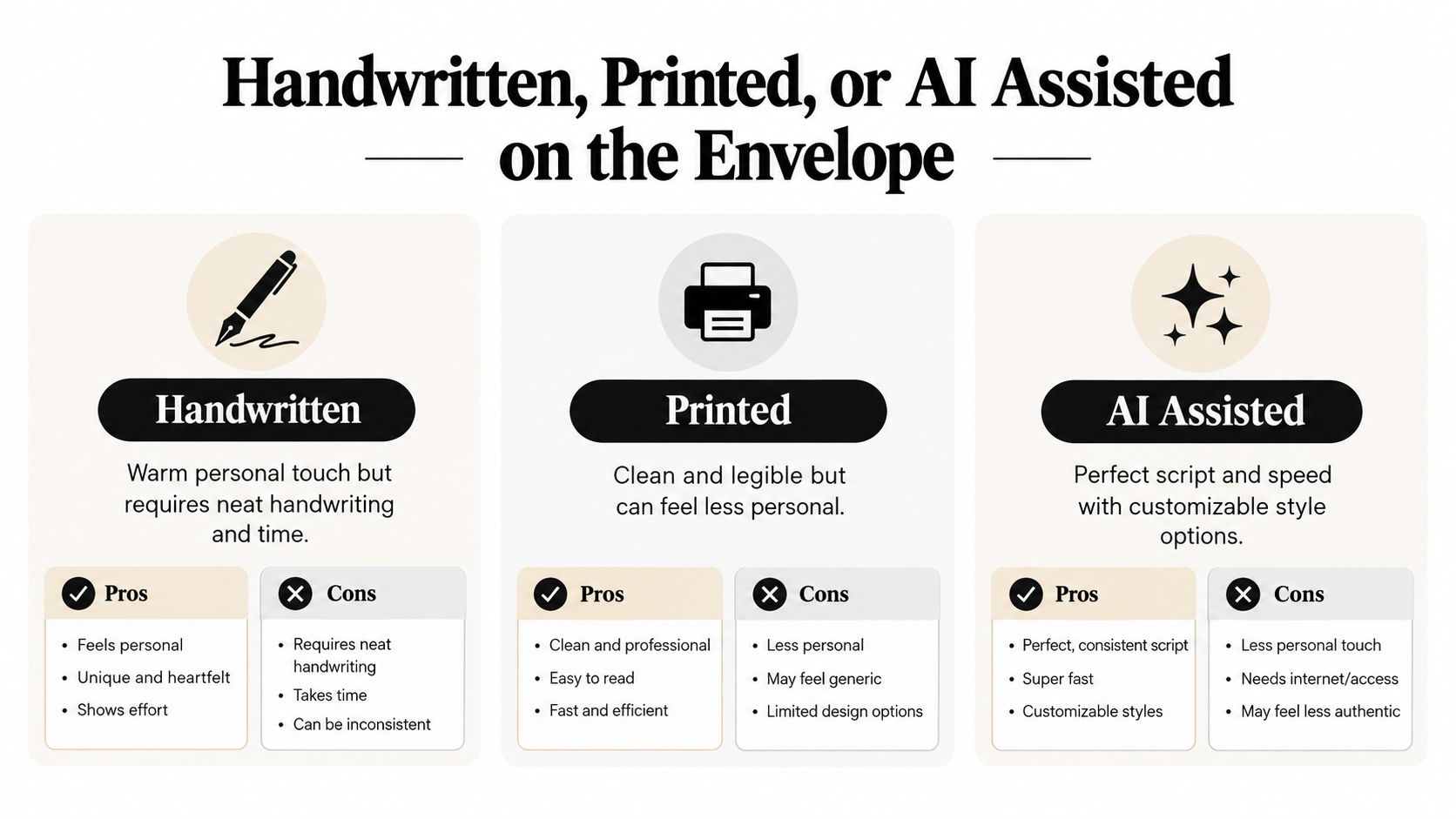
My rule is simple. Handwrite when the card is for someone close and the list is short. Print when you care most about speed and consistency. Use AI-assisted layout when you want the address to look deliberate without spending twenty minutes second-guessing the spacing.
Previewing the Final Card Before It Goes to Mail
The last check catches the sloppy stuff if you do it. On the outside, look for a return address in the top left, a delivery block that stays fully visible, an apartment or unit number on its own line when needed, and a ZIP that is easy to read. Clear addressing helps the mail sort cleanly, so this is about delivery, not just neatness.
On the inside, match the salutation to the relationship, keep the closing in the same tone, and make sure any date on a holiday card or occasion card is current. If you add a seal flap or back flap mark, keep it tidy and consistent with the rest of the card. A polished message still feels wrong when the envelope and the note seem to come from different people.
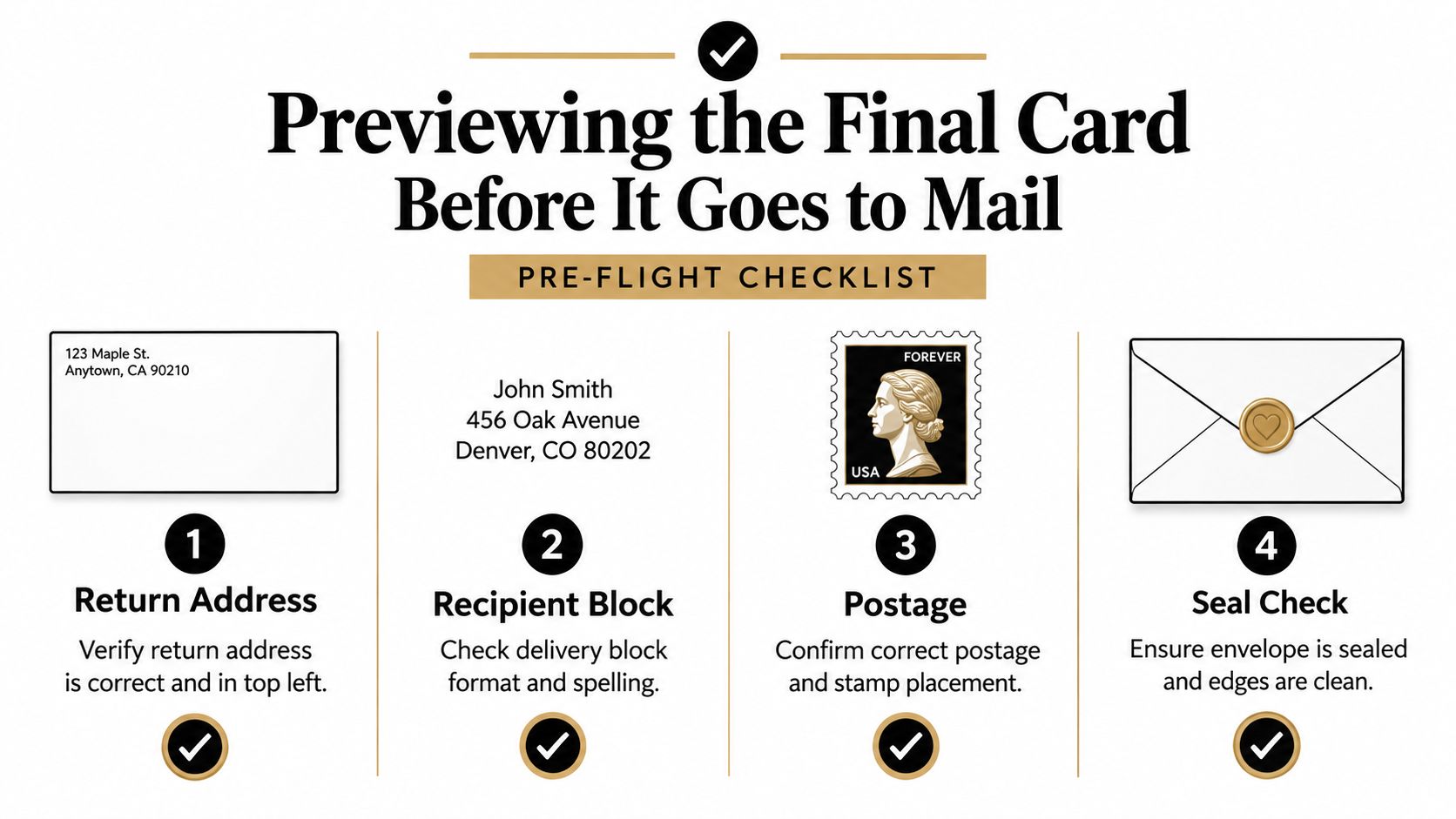
I always do a dry run before sealing anything. Hold the finished envelope next to a clean sample, or take a photo and read it cold on your phone. If you spot an error in five seconds, everyone else will too.
For a quick check on card styles before you print, the Mail This greeting card types guide is a useful reference.