You've found the right card, drafted something that sounds almost personal, and then stopped at the final question: what exactly will the recipient receive? A name may be misspelled, the message may wrap awkwardly, the address may be incomplete, or the total may change after you've committed. Physical greeting cards feel thoughtful because they're tangible, but that permanence also makes small mistakes more consequential.
The practical answer is an approval-first workflow. You can use an assistant to generate ideas, but you should remain responsible for the exact message, artwork, recipient details, and final cost. The card shouldn't move to payment or production until you've seen the complete version and deliberately approved it.
Table of Contents
- The Greeting Card Dilemma and Why Approval Matters
- Starting with Creative Input and Assistant Guidance
- Reviewing Your Design and Approving the Exact Message
- Understanding Pricing and Shipping Coverage
- From Approval to Physical Delivery
- Practical Tips for Exceptional Personal Cards
The Greeting Card Dilemma and Why Approval Matters
The hardest part of sending a card often happens before design begins. You know the occasion, whether it's a colleague's birthday, a family thank-you, or a note for someone going through a difficult week, but the blank page makes every option feel either too generic or too personal. A shop-bought card solves the writing problem but may sound unlike you. Designing one from scratch gives you control but introduces decisions about wording, images, layout, paper, envelopes, and mailing.
An assistant can remove the initial friction by turning a short description into several possible directions. You might provide the recipient's relationship to you, the occasion, a shared memory, and the tone you want. The result should be a starting point, not an automatic final product.

Why physical cards still earn attention
Greeting cards are not merely a nostalgic alternative to digital messages. The Greeting Card Association estimates that people in the United States purchase approximately 6.5 billion cards each year, with estimated annual retail sales of $7 billion to $8 billion. Around 9 in 10 U.S. households buy greeting cards annually, and birthdays account for more than half of cards sold. These figures come from the Greeting Card Association's industry facts.
The tradition has also evolved around reproducibility and personal participation. The modern greeting-card tradition is generally traced to England in 1843, when Sir Henry Cole commissioned artist John Callcott Horsley to create an illustrated Christmas card. The first commercial edition contained 1,000 copies, and the card combined a printed design with a concise seasonal message that the sender could make personal with a note. The British Postal Museum story on the first Christmas card documents that transition from handwritten correspondence to a repeatable physical format.
The approval gate changes the risk
A useful process separates creative assistance from production authority. The assistant can suggest a playful message for a teammate, a restrained design for a sympathy card, or a warm visual for a parent. You decide whether the wording sounds like you, whether the image suits the recipient, and whether the final address is correct.
Practical rule: Treat generated text as a draft until a human has read and approved every word.
The final preview should show the complete card, not an isolated image or an abstract mock-up. It should include the artwork, independently typeset message, recipient information, and total cost. That single checkpoint catches the errors that are hardest to correct later, especially a wrong name, an unsuitable tone, a missing apartment number, or text that looked fine in a chat window but fails in the printed layout.
A thoughtful card doesn't require professional design skills. It requires a process that keeps the sender in control at the point where creativity becomes a real object.
Starting with Creative Input and Assistant Guidance
Good card ideas usually begin with specific human context, not a design command such as “make a nice birthday card.” An assistant needs enough information to distinguish a close friend from a manager, a milestone from an ordinary occasion, and affectionate humor from language that could embarrass the recipient.
Start with a compact creative brief. Include:
- The occasion. Say whether the card is for a birthday, congratulations, thanks, encouragement, a holiday, or another event.
- The relationship. Identify the recipient as a partner, sibling, friend, colleague, client, or relative.
- The emotional temperature. Choose a tone such as playful, sincere, understated, celebratory, comforting, or formal.
- Personal evidence. Add a shared memory, hobby, recurring joke, favorite place, pet, project, or small detail that only you would naturally mention.
- Visual boundaries. Describe colors, objects, setting, style, and anything the design should avoid.
The reason for this order is simple. The occasion gives the message a purpose, the relationship sets its level of intimacy, and the personal detail prevents the result from sounding interchangeable. Visual instructions then support the sentiment rather than competing with it.
Turn one idea into several options
Ask for multiple candidate messages and visual directions instead of requesting a single finished card. A few alternatives make comparison easier. One message might be warm and direct, another lightly humorous, and another more reflective. For artwork, you might compare a clean typographic composition with a scene based on the recipient's interest.
Review each suggestion for truthfulness and ownership. Remove details the assistant invented, even if they sound plausible. Replace broad praise with something observable, such as a memory of a late-night conversation, a tradition you share, or a quality you've seen in action. The card should contain information you're willing to stand behind, not an impressive-sounding guess.
A useful guide to choosing the format is this overview of different types of greeting cards. The format can influence the amount of copy, the visual energy, and the level of formality.
Refine before you think about layout
Editing the message before it reaches the design stage saves time. Read it aloud. If you wouldn't say a phrase in conversation, change it. Check that the humor depends on context the recipient will understand, and remove language that sounds like a generic social-media caption.
Keep the message separate from the artwork concept. Generated images can be attractive while containing misspelled or distorted words, so the assistant should create the visual without carrying the final greeting inside it. The approved wording belongs in a controlled text layer that can be checked, edited, and typeset independently.
This approach preserves the useful part of automation, rapid ideation, while keeping the emotional decision with the sender. You're not outsourcing the relationship. You're using guidance to get past the empty page and into a set of choices you can make your own.
Reviewing Your Design and Approving the Exact Message
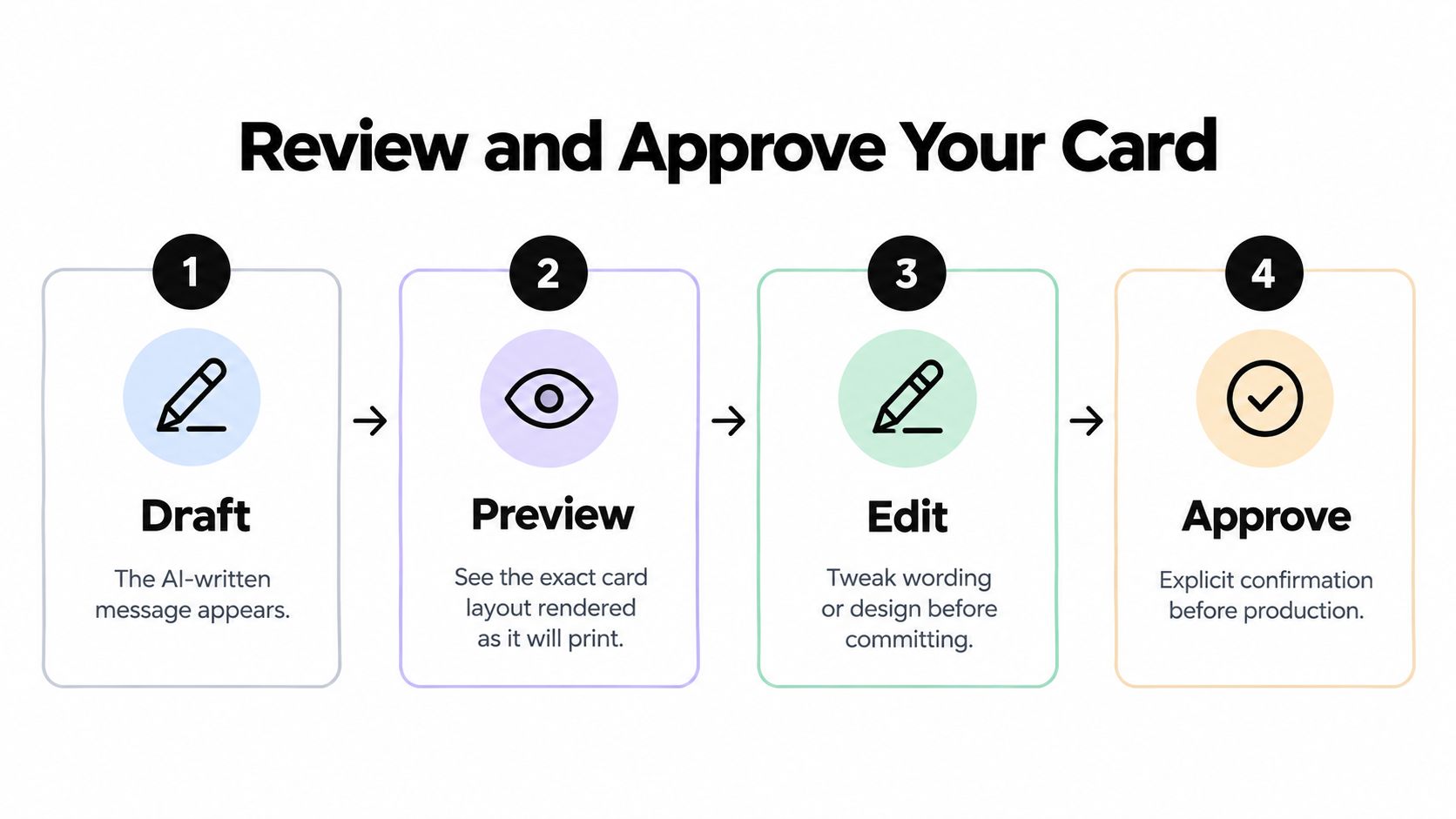
The preview is where a promising idea becomes either a sendable card or a clear no-go. Don't approve a design based on the front image alone. A complete review should reproduce the elements that affect the recipient's experience, including the artwork, exact copy, recipient details, orientation, and final total.
Check the message as printed text
The wording should be typeset independently from generated imagery. This distinction matters. Text embedded inside an AI-generated illustration may be misspelled, warped, cropped, or impossible to revise without creating a new image. A separate text layer lets you preserve the exact approved sentence and correct its presentation without altering the artwork.
Use a deliberate proofing pass:
- Names: Compare every name with the information you entered. Check accents, nicknames, capitalization, and possessives.
- Dates: Verify birthdays, anniversaries, event dates, and any year references.
- Pronouns: Make sure the language matches the recipient and the relationship.
- Line wrapping: Look for orphaned words, awkward breaks, cramped lines, and text that collides with a decorative element.
- Contrast: Read the message at normal size, not only while zoomed in. Pale type over a detailed background often fails in print.
- Tone: Ask whether the recipient would recognize your voice in the message.
- Image text: Confirm that no unintended words appear in the artwork itself.
If you need help with the wording, use a dedicated birthday card message guide for prompts and direction, then return to the exact preview before approving anything.
Review the mailing face as engineering
The address area deserves the same attention as the front cover. For U.S. mailed greeting cards, validate and standardize the destination with CASS-certified address software when available. Use an OCR-readable font sized from 10 to 12 points, isolate the address block from artwork and other text, and preserve at least 3/8 inch of clear space, with 1/2 inch recommended, around it. These postal recommendations are summarized in guidance on greeting-card addressing requirements.
Keep decorative graphics away from the address. Avoid low-contrast type, elaborate scripts, and user-entered line breaks that split a street address or city line in an unpredictable way. If a barcode is used, it belongs below the city, state, and ZIP line with at least 1/8 inch of separation from the address line and barcode edges, as described in the same postal-engineering guidance.
Approve only after the total is visible
A reliable approval screen shows the artwork, the message, the destination, and the total together. That prevents a common failure pattern: approving an appealing design in one step and discovering a different mailing detail or unexpected charge in another.
Read the card once as its creator and once as its recipient. The first pass catches technical errors. The second asks whether the sentiment arrives naturally, whether the image reinforces the occasion, and whether any joke could be misunderstood without your spoken explanation.
The approval button should mean “I have checked the artifact,” not “the idea sounds good.”
Only after that explicit confirmation should payment or production begin. If a service doesn't let you edit the message, inspect the address, and see the complete cost before commitment, that limitation is part of the buying decision.
Understanding Pricing and Shipping Coverage
Price transparency matters because greeting cards combine creative customization with physical fulfillment. A low-looking design price can become less useful if printing, an envelope, postage, tax, or artwork revisions appear later. Before you pay, identify what the base amount includes and confirm that the destination falls within the supported delivery area.
The service described here uses a flat price for a standard folded greeting card. The amount includes the printed card, envelope, and domestic postage, while applicable tax is shown before payment. Custom artwork has a separate generation structure, so distinguish the cost of exploring visual ideas from the cost of producing and mailing the finished card.
Greeting Card Pricing and Delivery Overview
| Item | Details | Notes |
|---|---|---|
| Standard folded card | $9.99 per card | Includes the envelope, printing, and domestic postage |
| Tax | Applicable tax shown before payment | Review the displayed total before approval |
| Artwork generation | One generation free after sign-in | Available for creating custom visual concepts |
| Additional artwork | Packs of five images cost $1.49 after card prepayment | Use only if further visual exploration is necessary |
| Supported delivery | U.S. states and Washington, DC | New York State is currently excluded |
| Unsupported destinations | U.S. territories and military addresses | Verify the destination before starting |
| Fulfillment | Printing, packing, addressing, and postal handoff | Handled by Cardly |
| Arrival information | Estimated arrival window and order status | Delivery dates aren't guaranteed |
Read coverage limits before writing
A card that can't be delivered to the chosen address is a failed order, regardless of how good the design looks. The current coverage includes U.S. states and Washington, DC, but excludes New York State, U.S. territories, and military addresses. A shipping-coverage check or API can verify the destination before you spend time refining the message.
That check should happen near the beginning, not after the card is finished. It also gives you a chance to correct incomplete secondary-unit information, normalize abbreviations, and confirm that the recipient's destination is supported.
Understand the role of the fulfillment partner
Cardly handles the physical steps after approval, including printing, packing, addressing, and handing the card to the postal service. This reduces the number of tasks the sender must coordinate, but it doesn't remove the need for careful proofing. Fulfillment can reproduce the approved file accurately, but it can't know that you intended “Mara” rather than “Maria” unless the approved source says so.
An estimated arrival window is useful for planning, but it isn't a guaranteed delivery date. Postal variables can affect the final arrival, so urgent cards need more planning than casual notes.
From Approval to Physical Delivery
After approval and payment, the conversational part of the process becomes a production specification. The chosen orientation, artwork, recipient details, and independently typeset message move through the connector and hosted preview flow to the fulfillment process. The sender no longer needs design software, a home printer, envelope stock, or a separate trip to the post office.
The planned folded card measures 125 × 175 millimeters, approximately 4.9 × 6.9 inches, and can use portrait or horizontal orientation. That format gives the artwork a defined physical boundary, which is why the preview should be judged as a printed composition rather than as a flexible screen image.
What the handoff needs to preserve
A dependable handoff carries more than the picture. It must preserve:
- The approved message: Exact wording, punctuation, names, and line breaks.
- The mailing record: The validated destination and any required secondary-unit detail.
- The design specification: Orientation, artwork, and card format.
- The order status: Visibility into the estimated arrival window after production begins.
The connector API and hosted preview flow are designed to bridge an assistant conversation with fulfillment in the Muse ecosystem, although directory availability depends on platform review. That distinction matters for anyone evaluating the workflow as a product integration rather than using it only as a consumer.
For the sender, the physical result should feel simpler than the underlying process. The assistant helps shape the idea, the preview makes the decision explicit, and the fulfillment partner handles the material steps. The sender's most important responsibility remains the same throughout: approve the artifact that will be printed and mailed.
Practical addressing details still matter after the design is finished. Review this guide to addressing a greeting card before final approval, especially if the recipient lives in a multi-unit building.
Set expectations about arrival
Status visibility and an estimated arrival window provide useful reassurance, but they don't promise a specific delivery day. Avoid scheduling a card around an exact date unless you have enough margin for postal variation. For ordinary birthdays, thank-you notes, and personal encouragement, the service is most predictable when you treat delivery as a window rather than a fixed appointment.
Practical Tips for Exceptional Personal Cards
Personalization works best when it adds evidence of a real relationship. A recipient doesn't need a long essay. They need a phrase, memory, image, or observation that couldn't have been copied into anyone else's card.
Make the message sound like you
Start with the assistant's draft, then replace its broad language with something concrete. “You always make people feel welcome” becomes stronger when paired with the moment you noticed it. A reference to a shared trip, a recurring phrase, a favorite meal, or a difficult project gives the card a human fingerprint.
Keep the occasion in view. A close friend's birthday card can carry playful exaggeration, while a sympathy card needs restraint and space for the recipient's feelings. A workplace thank-you may benefit from warmth without private humor that could feel out of place.
Use this quick editing test:
- Delete the obvious sentence: Remove the line that could appear in any card.
- Add one recognizable detail: Mention a memory, habit, interest, or quality tied to the recipient.
- Read it aloud: Change wording that feels formal, inflated, or unlike your normal voice.
- Check the emotional weight: Make sure the message matches the occasion rather than forcing cheerfulness into a serious moment.
A U.S. survey of 2,000 consumers cited by Grand View Research found that 55% preferred a personalized message over an AI-generated message, according to the U.S. greeting-card market analysis. That preference supports a human-in-the-loop process. Let automation offer options, but make the sender's edit or explicit approval the final authority.
Give the preview a physical-reading test
Zoom into the message, then zoom back out. A line that looks balanced at close range may become too small or low-contrast at the size a recipient will read. Check the interior, cover, and envelope separately because each has a different visual job.
The envelope is the first physical touchpoint. Keep the address clean, legible, and visually isolated. Don't let decorative artwork crowd the address zone, and don't assume that a stylish script will be easy for postal equipment to interpret.
A short review video can help you think through the sequence from draft to approval:
Choose materials with evidence, not labels
Sustainability claims need more scrutiny than a green icon on a product page. Current market coverage highlights recycled paper, certified fiber, plantable stock, soy- or water-based inks, and plastic-free packaging, while also describing eco-friendly greeting-card products as growing about 8.2% annually in 2025 in a projection cited by market reporting on sustainable greeting cards. The feature list alone doesn't reveal the full impact.
A heavier premium stock may require more transport. Plantable material or coatings may complicate recycling. A physical card also involves printing and postal handling compared with a digital message. The most defensible choice is usually the one with clear material percentages, credible certification, recyclable packaging, minimal finishing, an appropriately sized format, and disposal instructions.
A sustainability claim is useful only when you can identify the material, packaging, and disposal path behind it.
Choose recycled or responsibly certified fiber where possible, avoid unnecessary plastic and decorative layers, and use a compact design that doesn't add weight without adding meaning. That approach keeps the card warm while making the environmental trade-offs visible.
Peak seasons also deserve planning. High demand may extend an estimated arrival window, so order with room for postal variation rather than relying on a precise delivery date. Above all, don't skip the final proof because the occasion is approaching. A late correct card is usually more thoughtful than an early card with the wrong name.
Use an assistant to break creative block, not to surrender your voice. Draft several directions, add a detail only you would know, inspect the complete preview, and approve the exact message and destination before production. Mail This turns that process into a physical greeting card workflow with personalized artwork or photos, independent message typesetting, preview-based approval, printing, addressing, and domestic postage. Start with one occasion and one specific memory, then review every detail before you send it.